 |
|||||||||
| |
|
|
|
|
|
|
|
|
|
Curvemeister 101: Week 2
- Rearranging Curvemeister's Windows and Buttons
- Know your Colors
- The Hue Clock, a Visual Speedometer
- So What's in a Neutral
- RGB Land of Many Neutrals
- Sample Size....Matters
- LAB: Land of One and Only One Neutral; and Fast and Furious Color
- Color Correction In LAB Without Setting A Neutral
- HSB - The Color Space for Artists, and People -Who Need a Handle on Saturation
- CMYK-Printing Press Land or Ink on Paper.
- Shadow and Highlight: They light the way to better images:
- Finding the Shadow and Highlight
- Increase the Slope = Increase the Contrast
- Increasing Contrast using RGB and Lab mode
- Using the Hue Clock to Correct a Neutral
- Using Floating Neutrals to control Overall Brightness
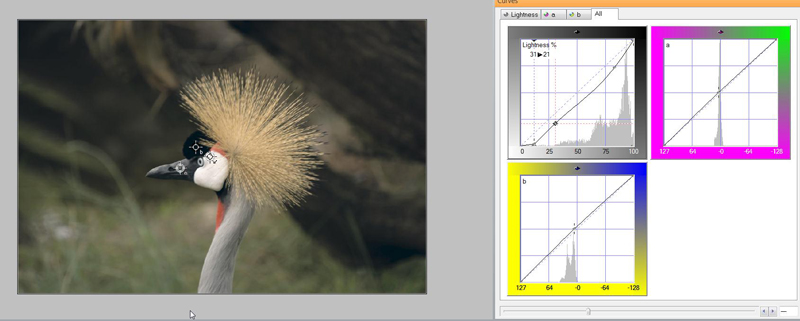
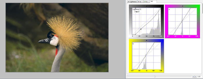
Example 1: Merry-Go-Round: Correcting Underexposure
Example 2: Monterey Bay: Adding Color in Lab
Example 3 :Pumpkins: Using Saturation to Emphasize Form
Example 4: Taiwanese Holiday Wreath, emphasis CMYK
Example 5: Sun Moon Lake: This Time with Feeling (and Lab)
Example 6: Taroko Gorge- Shadow, Highlight, Neutral, and More
Example 7: Angkor Thom. Floating Neutrals
Rearranging Curvemeister's Windows and Buttons
![]() There is a video version of this section.
There is a video version of this section.
Curvemeister's "out of the box" configuration.
When you ran Curvemeister for the first time, you saw a window layout that looked something like Figure 1, with the curve window on the right and the pins along the bottom of the window. You are free to make big changes in the way the windows are arranged, and to the overall layout of the ribbon controls along the top of the window. You may use toolbars for common commands, select which commands are on the toolbar, and select the keyboard shortcuts for the commands. You can even re-create the look and feel of Curvemeister 2. Let's take a quick look at this is more detail.
Docking PalettesYou may click and drag the top margin of the pin palette and dock then to any edge of the curvemeister window . For example, I like to move the pin palette to the left edge of the window, so that I will have more vertical space for the image. The same procedure works for the curve palette, and for the mask carte (not shown here). I generally close the pin palette when I am not using it. |
 The pin palette has been moved to the left margin. |
Floating PalettesIf you press the control key while dragging a palette, it becomes a free-floating window. This is useful when you want extra space for the image, and don't mind having a window floating on top, or when you have two monitors - this allows you to have a very large, easy to modify, curve window on a second monitor. |
 The curve window, un-docked so that it is a free floating window. |
Minimizing the RibbonTo further save vertical space, you may want to minimize the ribbon control so that only the tabs are normally visible. Note: I recommend that you keep the ribbon visible because it is so much easier to find the commands. |
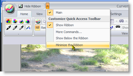 Minimizing the ribbon. |
Hiding the RibbonTo completely hide (or un-hide) the ribbon, right click on the image, and select the Hide Ribbon command.This allows you to recreate the command layout of Curvemeister 2. But how can you access the commands? Enter the toolbar. |
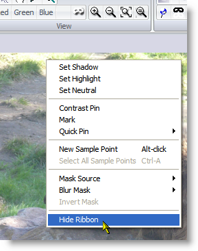 Hiding the ribbon |
Making the Toolbar VisibleCurvemeister's main toolbar is hidden by default. You can make it visible by right clicking on the upper margin of the ribbon, and clicking on Main. You may also use the same menu item to hide the toolbar. |
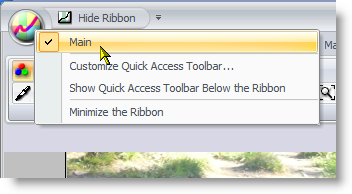 Showing the main toolbar. |
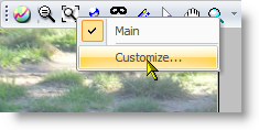
The Main ToolbarThe main toolbar has a variety of commonly used commands. You may add or remove commands from the toolbar using the Customize menu item. |
|
Adding a Toolbar CommandClick on the Commands tab in the Customize dialog, select a command category, and drag whatever commands you may want to the command bar. To remove an existing command, press the alt key, and drag the command away from the command bar. There are additional tabs that allow you to customize other things, including accessing commands via the keyboard, and for changing the commands that are available at the top of the ribbon bar. |
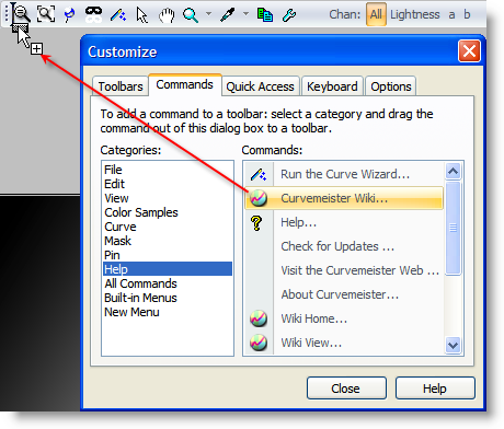 Adding a new command to the toolbar |
Know Your Colors
Briefly, each color in an image can be described by three or four numbers. The following table contains some familiar colors, and their values, in four different color spaces. The rather bewildering set of numbers below is something that will start making sense to you as time passes.
For starters, can you spot the RGB numbers that correspond to pure red, green, and blue? Of the remaining colors in RGB, the only tricky one is yellow, which is magically created by equal amounts of red and green. In Lab, the first number tells you how bright the image is, and the second two numbers give the color, with positve values for those two numbers indicating warm colors, and negative numbers cold colors. HSB is a re-arrangement of RGB, with the last number indicating brightness, and the first number indicating the location, in degrees, of the color on the Hue Clock, red being 0 degrees. CMYK is not much more difficult, once you know that cyan is red, magenta is green, and yellow is blue.
Other small tricks exist for memorizing and interpreting colors. For example, to determine an RGB color, ignore the smallest of the three RGB values, and the color will be in between the remaining two colors, weighted toward the larger of the two. CMYK is the same, but with different primaries. Lab has two color channels - both are positive in the warm direction
| RGB | Lab | HSB | CMYK* | |
| Red | 255,0,0 | 51,81,70 | 0,100,100 | 0,86,77,0 |
| Green | 0,255,0 | 88,-79,81 | 120,100,100 | 55,0,82,0 |
| Blue | 0,0,255 | 30,68,-112 | 240,100,100 | 88,74,0,0 |
| Cyan | 0,255,255 | 91,-51,-15 | 180,100,100 | 37,0,16,0 |
| Magenta | 255,0,255 | 60,94,-60 | 300,100,100 | 39,62,0,0 |
| Yellow | 255,255,0 | 98,-16,93 | 60,100,100 | 0,10,85,0 |
*Note that the CMYK values here are actual CMYK ink values, as used in Photoshop for print documents. They are not the wgCMYK color values normally used in Curvemeister.
At some point in the not too distant future, y ou should be able to puzzle out a given color from the numbers. Reading numbers can be slow work, and it is not everyone's piece of cake. Enter the Hue Clock.
The Hue Clock, a Visual Speedometer
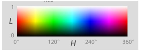
The hue clock is a great way to visually evaluate color on your screen, because you can get an objective indication of the color of an object very quickly, without resorting directly to numbers. It uses the HSB color space, which describes the color of an image in terms of its hue, saturation, and brightness. Let's look at each of these in turn.
The hue of an object is the angle on the color wheel occupied by the object's color. It is determined by the color pigment, or mixture of colored pigments, that make up the object's surface, as well as the light falling on the surface.
 Curvemeister's stand alone hue clock, indicating a sky blue color. This hue clock can be accessed from the "Start Button" in Windows. It is found in the "All Programs" >Curvemeister Group. |
The most common definition of hue is as an angle from 0 to 360 degrees, with red at
0 degrees. I find it easier to remember hues as times on an analog clock, so red would be12 and cyan would be 6 o'clock. Likewise, yellow is 2 o'clock, green is 4 o'clock, and so on. |
The length of the hand indicates the saturation, or purity of the color. An absolutely pure red would have the hand at maximum length, out to the edge of the hue clock and about the length of the minute hand on a clock. Real-world objects - for example skin tones, are represented by the length of an hour hand, or out to the embossed circle on the hue clock. If the hand is very short, or even a small circle, this indicates a gray color.
The Hue Clock provides no indication of the brightness of the color. This is by design, since more or less light falling on an object does not change its color.
It is easy to memorize a particular color as a time on the hue clock. The image on the right shows typical hue clock readings for three very important colors. Skies, generally speaking, should be 7:30 on the Hue clock, just a bit on the cyan side of blue (never on the magenta side). Foliage should be at about 2:15 to 2:45, on the green side of yellow. Skin tones, of any race, should fall within a typical lunch break, between red and orange-yellow. It's not unusual for images of very light-skinned individuals to stray a bit into the magenta side of red, but they will look healthier with their color adjusted into the nominal range. The length of the hue clock hand is significant, with natural objects seldom having the hand long enough to touch the letters around the edge of the hue clock. Skin tones, in particular, take on a disturbing orange tint when over saturated. |
 Create a hue clock by alt-clicking on the image. |
By relying on the hue clock, your ability to detect a correct skin tone becomes an objective decision, instead of a subjective one. Your ability to set a correct color is not influenced by other nearby colored objects, or even by problems such as an incorrectly calibrated monitor. Color blind individuals can easily get good skin tones using the hue clock.
So What’s in a Neutral?
When it comes to image correction it appears to be a great deal. In most images there is some item or area that should appear to your eyes to be Gray. Not Green Gray or Yellow Gray but just plain old Gray. These areas are extremely important to the overall process of image correction and using curves. Items like concrete, black tires, white shirts, shadows on a white wall, certain parts of clouds are all good locations to try to set a neutral point.
The neutral point of an image can be defined in many different ways; terms like “middle gray”, “neutral gray”, and “mid-tone gray” all have been used to define a specific color that for lack of a better term lacks color or hue in perception. The color has definite values and depending on the color space we are using has different properties.
If you have not already read the article on color spaces and curves from last week you can find it here:
Understanding the Curves interface
In order to better understand color correction overall you need to fully understand the concept of neutral. Let's start our understanding of neutrals with one of the best color spaces for general color correction RGB.
RGB Land of Many Neutrals:
In RGB every Pixel is defined by three color values expressed as a set of numbers (R,G,B). The maximum value for any one of the three is 255 and the minimum is zero. Every color in the color space RGB is defined by the combination of these three color values and that means that there are millions of colors possible using RGB. The interesting thing about RGB is that if all three values are equal you have a gray pixel at what ever brightness value they are set to.
(10, 10, 10) is black visually but it is also neutral; Also (250, 250, 250) is white visually and it is neutral as well. Wait a minute; 2 neutrals in RGB that are not Gray??
It is possible in RGB to have 255 neutrals; that is what we call a B&W image.
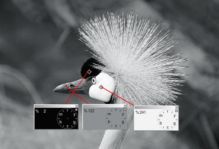
Notice that the Hue in the above picture is not defined. The Hue clocks shown have no arms because the image is made up of all neutrals. As you can see the "floating hue clocks" describe specific tonal areas of the image by brightness but in RGB they all have equal values. In RGB notation the panels would have the values (2,2,2) then (122,122,122) and (241,241,241).
This is a VERY IMPORTANT concept to fully understand. Later in the class we will be using this to color correct images without setting a neutral. The method is called “By the Numbers” and it is one of the most effective ways to color correct an image.
“Ok, so how do I know it is neutral?” Most of the time you are going to be setting a neutral on an item that you know is neutral Gray. (Concrete, black tires, white shirts, shadows on a white wall, certain parts of clouds.) There is no point in telling Curvemeister that something is neutral that obviously is not; that would add a color cast to the image rather than remove one which is the point of setting a neutral in the first place. Likewise using the hue clocks to chose a neutral makes little sense because they show you what is in the image not what should be in the image.
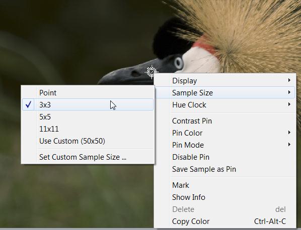
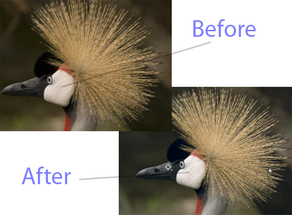
Sample... Size Matters:
When you set a neutral in Curvemeister you are telling the program to look at a sample of pixels under your mouse and set the average value to be a neutral gray. The key word here is SAMPLE;
Curvemeister allows you to set the size of the sample you are taking on the image and your choices for this can have profound effects on the out come of the correction. The larger the sample size you choose the lower the accuracy in this particular setting. Here is why; a 3X3 sample is 9 actualy pixels; you are getting a much more accurate measure of your selected point. If you set 11X11 as the sample size; you are getting 121 pixels in the sample and your chances of selecting a non-Gray pixel are much higher. Less is not necessarily more either. Setting less than 3 pixels will make the setting too sensitive for practical use. Always remember that Curvemeister is going to find the average of the selected pixels and then set that value as the neutral for that specific brightness.
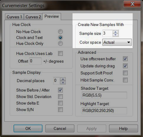
Individual Shadow Highlight and Neutral markers can have the sample size set within them as well. To access this feature you need to right click on the setting point and chose sample size from the fly out menu as shown below.
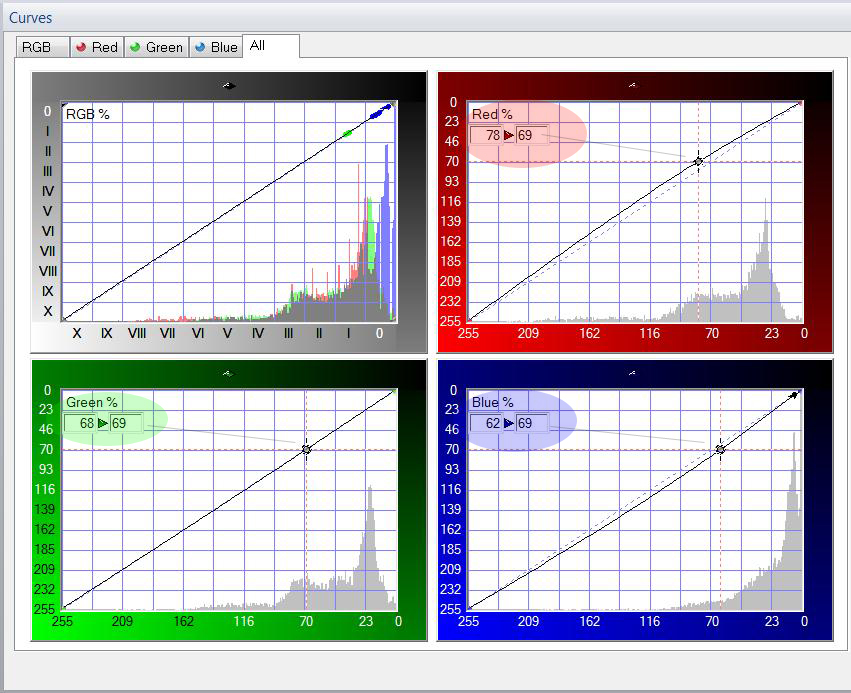
When you set a neutral the curves are adjusted by Curvemeister to make your selected point neutral. If you have chosen a neutral that is correct for the image the overall color balance will shift and your image will look as though you have removed a plastic film of color cast from it. Notice that the second numbers shown below are all 69. That creates an RGB value of (69,69,69); making the chosen point neutral. Each input value; the first number, is different and the results are shown below the curve grids.
Most of us started learning RGB colors early on because it was there, and we had no choice in the matter. If this is not the case, and you are just starting out, you have a good chance at being multi-lingual in color spaces.
RGB is a useful color space to learn early on, because our monitors, cameras, and scanners use it. But RGB is not the be-all and end-all of color spaces, any more than your native language is the only, or even the most important language in the world. Let's make a leap and try to imagine that the four color spaces listed above are different countries. RGB is the United States, Lab is France, HSB is Italy, and CMYK is (in honor of Herr Guttenberg of printing press fame) Germany.
Speaking only English (or RGB), you can cover a lot of territory. But there is more.
Folks who speak only RGB are often not interested in speaking the other color spaces, partly because, as is the case with English, old habits are hard to break, and, besides, you can go so very far in this world speaking only RGB. Many people ignore all the other color spaces, even after paying good money for a program like Photoshop, which supports Lab and CMYK, in addition to RGB. Owning Photoshop and speaking only RGB is like living in Quebec and ignoring French, or living in Warez and ignoring Spanish.
Giving RGB it's due, although it is the second choice to Lab for many images, it is an excellent color space for images that need a boost in both color and contrast, a prime example being underexposed images. It's also a great color space for mixed lighting situations. The results in this situation are simply more natural, and easier to achieve - two very good reasons to turn to RGB first for underexposed images.
Example 1: Merry-Go-Round: Correcting an Underexposed Image in RGB
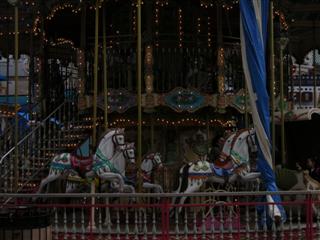
[right click here and use "Save As" to access the full sized image]
![[right click here and use "Save As" to access the full sized image]](images/2007-02-12_122115.jpg)
![]() This example has a video hint.
This example has a video hint.
Use RGB to bump the brightness of this underexposed image, and to add a bit of color. Although the RGB composite curve is often frowned upon, you have a dispensation to use it here for this image. See if you can get the same amount of color and contrast, as easily, in Lab.
In addition to moving the end points of your curves, it's now time to add control points to the interior of your curve. In this case add at least two points, equally spaced along the curve, and move them up or down to accomplish the following. Add one control point and move it vertically to make the shadows steeper, and a second control point to keep the brighter parts of the curve from "flattening out" and robbing detail from the sky. Keep a natural appearance, but feel free to add contrast where you think it is appropriate.
LAB: Land of One and Only One Neutral; and Fast and Furious Color
|
Lab is powerful; Very powerful, It allows you to do some very profound things to your images. Using LAB as a color space can be like hitting your image with a very large and colorful hammer. For all its color power though it lacks grace in handling a neutral. LAB is a much larger color space than RGB; this means that you can create colors in LAB that RGB cannot represent and they will be out of gamut for RGB. This can cause problems if you are not careful. Poor LAB can only have one neutral and that fact makes it very important for you to understand the concept of neutral because in the LAB color space; color is completely separated from brightness. This separation is wonderful for images with a single color cast or better put; a uniform color cast; but it is nearly impossible to fix images with multiple color casts in LAB. Those are best left to RGB. The Lab color space consists of three channels noted as (Lx, Ax, Bx); L which is lightness expressed as (0-100) on a scale, the A curve which represents the Red to Green axis of the color space and the B curve which is the Yellow to Blue axis. Values in A and B can be positive or negative values. Positive values are the warmer colors and negative values are the cooler colors. Therefore a LAB notation like (L20, A-5, B15) would show you that the color is a yellow green and fairly dark. In LAB adjusting the L channel has no effect on the hue or saturation of the colors in the image; L only “sees” brightness. This makes the L space a great place to set the overall tonality of the image. The center of the A and B channels are the only place in LAB where you have a neutral. If the point you choose to set as a neutral is not actually at 0,0 in A and B then Curvemeister moves the center of the curve to the point you have set and it re-calculates the values for every color pixel in the image based on the new center you have set.
|
 |
When you set a neutral in LAB you are telling Curvemeister to move the A and B curves to make the point you have chosen to be at the center of the curve grid at 0,0 for both A and B. In the initial adjustment you will see the A and B channels bend the curve but if you apply just that change and come back into Curvemeister the curves will have been re-centered and the neutral you set will be at the 0,0 axis of both A and B.
This image shows the LAB curves with a neutral selected. Look very closely the curve lines are slightly above the center and you can just make out the dashed diagonal line below the curve.
This image shows the neutral point applied to the image and the curves re-centered. You can no longer see the dashed line.
The Lab color space also has a Saturation slider that allows you to adjust the color saturation in LAB without messing up the brightness. (Score one for LAB) the same adjustment in RGB would introduce wild color casts.
This LAB Image has a S/H/N point selected. Notice the muted colors.
Here is the same image after using the Saturation Slider to make the LAB colors more saturated. Notice that the A and B channels rotated around the neutral point and the slope of the curves is the same.
Using the saturation slider is an important part of the LAB correction process. As you adjust the overall contrast of an image you change the apparent brightness of every pixel in the image. If the same image is brought into RGB after the L channel is adjusted the image will look de-saturated because the RGB values will have changed in brightness.
Using the saturation slider solves this problem by causing the A and B curves to pivot around the center of the curve grids or your around your set neutral. Remember the Neutral is the 0,0 of the grid. The saturation slider is a two way street; you can also de-saturate an image using the slider as well. While this may come in handy for some things it is a rarely used function of the slider.
Color Correction in LAB without setting a neutral:
While this is not as easy as setting a neutral; it is sometimes much more effective to set a hue clock on an image and adjust the A and B curves independently so that you choose a neutral. When you do this you should grab only the endpoints of the curve and move them up along the sides of the curve frame depending on how you want you colors to look. Please watch the video hint.
 Video Hint: Correcting LAB color without using a neutral.
Color Casts and How to Remove Them:
A color cast can be thought of as a systematic color added to an image, or an object within an image. It may be due to lighting, in-camera processing, or any other cause. Whatever the source of the color cast, it is almost always desirable to remove the color cast completely. The effect of removing the color cast is like lifting a colored shroud from the image, and allowing the colors to shine through.
Removing the color cast can be done by relying on the "numbers". Probably the most versatile method is to locate an object in the image that you are very, very certain should be gray. When you have identified such an object, right click on it, and place a neutral there. In most cases, if there is a significant color cast, you'll see an immediate improvement throughout the image, with colors becoming more intense than they were.
In Lab mode, only one neutral can be in effect at a time, and the entire image, regardless of brightness, will have it's color changed uniformly. Lab's ability to surgically change color without affecting the overall contrast of the image can be a great advantage when the color cast is uniform, and also when the color cast is very intense.
In RGB mode, several neutrals may be used at the same time, provided they are on objects whose brightness is different. In cases where the shadows are tinted a different color than the brighter parts of the image, this can be a great advantage. The most common example of this is the blue tinted shadows that are characteristic of almost every outdoor photograph. Removing the blue mimics the ability of the eye to compensate for color casts, and gives the image a more natural appearance.
In some cases, such as blue snow shadows or warm sunset colors, you may decide to deliberately retain a color cast. This decision should be based on your own artistic decision, and not on the fact that the camera happened to take a picture with a particular color. Many such images will benefit from having an artificially designated neutral in them that serves as a pivot point for complimentary colors in the image.
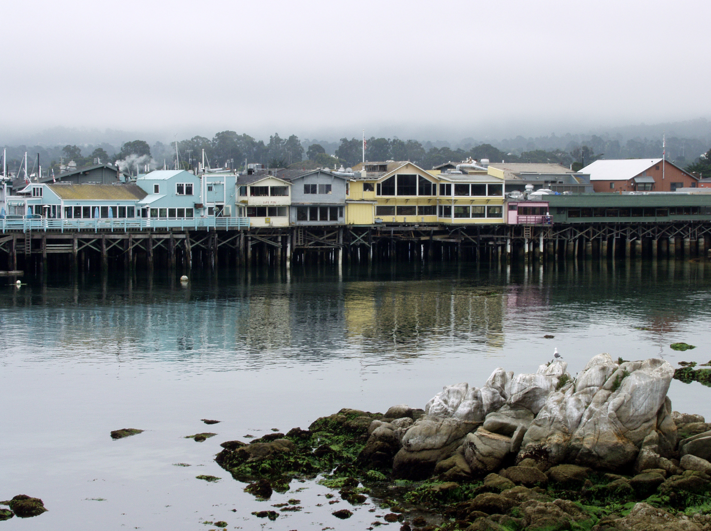
Example 2: Monterey Bay: Adding Color in Lab
[right click and use "Save As" to access the full sized image]
Set the Highlight and Shadow values so that you have a full range of contrast in the image. Then use the saturation slider to ramp up the color. Use care to only add enough color to the image to make it bright and happy but not so much as to lose the details within the image. Also try this image without the Saturation Slider by adjusting each curve independently. Your goal should be bright vibrant color without loss of details and no color cast. Try this image a third way using RGB and see if you can get the same results.
HSB - The Color Space for Artists, and People Who Need a Handle on Saturation
The HSB color space is more closely related to paint mixing than any other color space in Image correction. The three channels are H for Hue, S for Saturation and B for Brightness. The separation of the three basic components of color in this manner gives you some advantages when it comes to color saturation and image brightness; but it costs you in control of the overall color of the image.
In the current version of Curvemeister Hue is shown in a curve window the same as any other color channel. The trouble is that hue is best represented by a circle. The hue of a color is expressed in degrees from zero to 360 where zero and 360 overlap the color is red. Thus adjusting the red parts of an image require you to move both ends of the curve. Another way of viewing the Hue curve is shown bleow.
Another property of the Hue curve has is the ability to manipulate single colors and in some cases replace them with another color. We will be doing an example of this later in the course.
The Saturation curve of HSB is capable of changing saturation of any specific color only where it is needed. This gives it the ability to help you define shapes by adjusting the saturation of the shapes color across the surface. Think about how apples look; the shape of the apple is defined by the color saturation as the color wraps around the apple.
The Brightness curve in HSB is very similar to the L channel in LAB and it behaves in much the same way.
Example 3: Pumpkins - using Saturation to Bump Color, and Emphasize Form
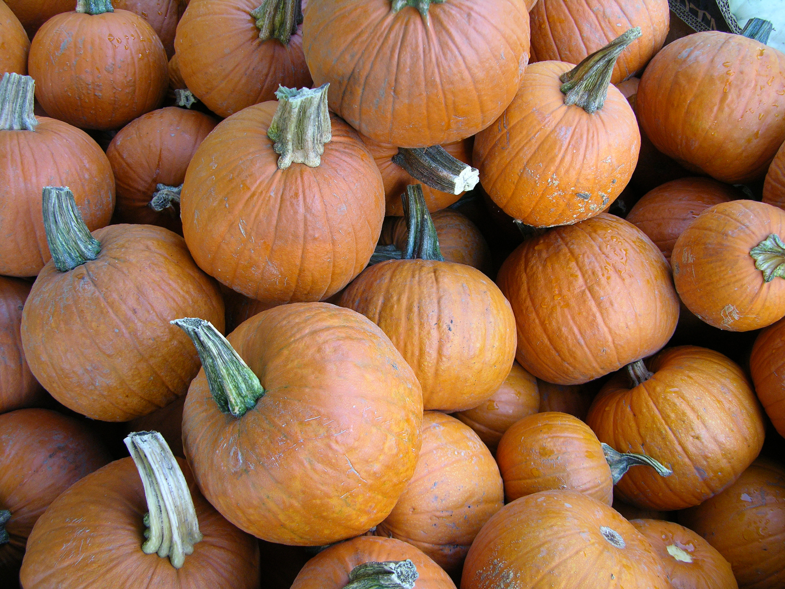
[right click and use "Save As" to access the full sized image]
![]() This example has a video hint.
This example has a video hint.
Let's try something new. The round shape of the pumpkins in the image above is due to a change in saturation of the orange color. Use the Saturation curve of HSB to do two things, increase the intensity of the orange color (always keeping a natural appearance), and the variation in saturation. This will have the effect of making the pumpkins seem shinier and rounder. Don't go too far though, or the shiny spots will look like a rampant case of pumpkin mold. While you're at it, use the threshold feature to adjust the brightness and add two interior points to the brightness curve to give the pumpkins more texture and contrast.
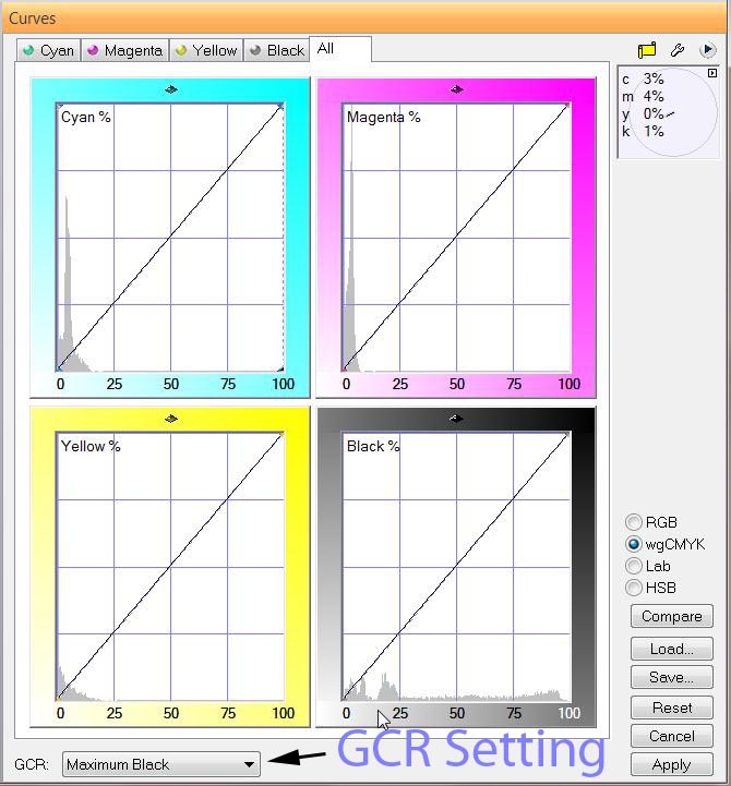
CMYK - Printing Press Land or Ink on Paper.
CMYK is probably the most misunderstood color space in Photoshop and Curvemeister. It is a very precise color space for image correction; for that reason it is also probably the hardest for most people to understand. There are many different versions of CMYK out in the world. These various color spaces are all variations on a theme and are related to each other in that they all describe how ink from a printing press behaves when it lands on a specific piece of paper.
This can be the stuff of high end color correction and pre-press color separation; another area where people write books and have spent a great deal of time being extremely precise in description and measurement. We don’t have a need for all of that information at this stage of your color correction education; rather we are going to scrape the tip of that iceberg and hope we do not sink too deep into the waters.
CMYK is a subtractive color process. It uses Colored ink to subtract light reflected from a page into your eye. Many people think of CMYK as a negative RGB color space and for the most part that is true with a very important twist; the K channel. I am starting with the K channel for a very important reason, Without K channel most printed images would look awful. They would appear muddy and off contrast; the colors would lack depth and all of the pages of your magazines would stick together.
The K channel is such a wonderful channel we often steal it for other uses in color correction. Later in the class we will be using the K channel to make masks for everything from sky corrections to controlling saturation. The reason K channel is so versatile is that you have a setting in the K channel that can change how it is calculated.
The GCR adjustment in CMYK tells Curvemeister and Photoshop how to simulate the Black ink in the CMYK model. There are various settings for GCR from “No Black” to “Working CMYK” with “Light, Medium, and Heavy” in the middle. These settings tell Curvemeister how much Black “ink” to add to the calculations to produce the K channel used for your image. They also have an effect on the overall image as far as shadow and highlight density is controlled.
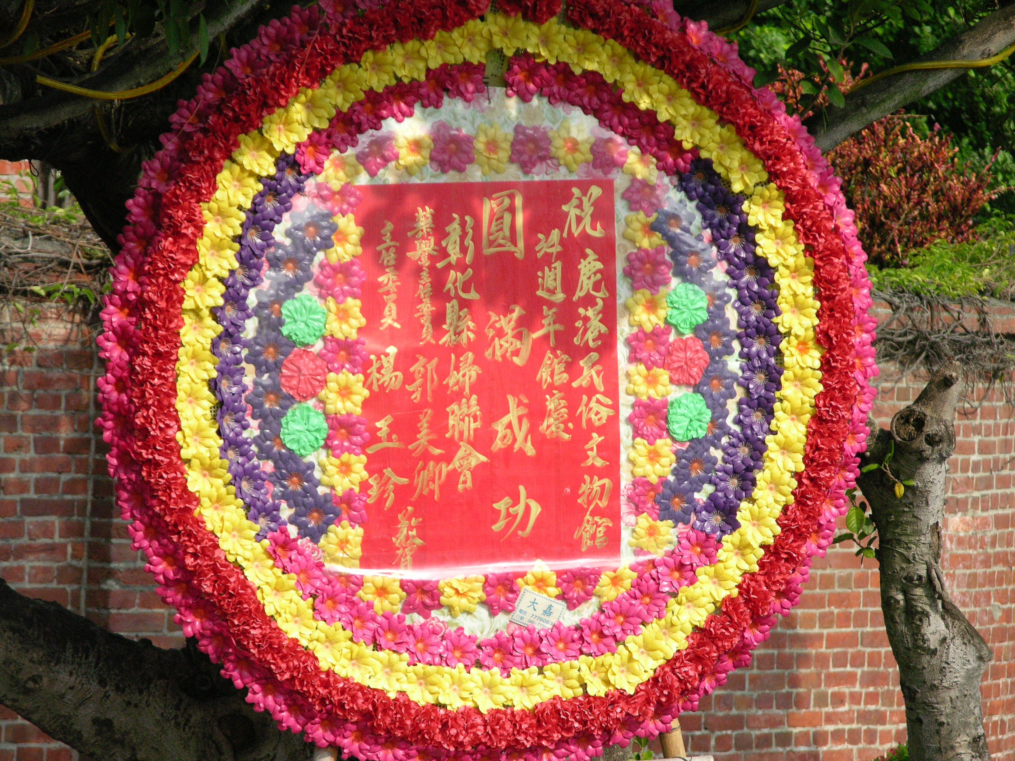
Example 4: Taiwanese National Holiday Wreath ", emphasis CMYK
[right click and use "Save As" to access the full sized image]
![]() This example has a video hint.
This example has a video hint.
Use Curvemeister's wgCMYK curves on this image, setting GCR to light, and see how CMYK gives you individual control over each color. Add more K to the mix, and see how you can control the shadows. Remember that the shadows and highlights should be neutral and there is details in the highlights you will want to preserve.
Shadow and Highlight: They light the way to better images:
A word here about setting Shadows and Highlights in your images; SIGNIFICANCE. There I said it; I’m proud I said it and now I’ll explain it.
When you set the Shadow and Highlight in an image correction you are setting the upper and lower boundaries of what detail your image will contain. Areas darker than the shadow point will lose detail and likewise areas brighter than the highlight point will be blow out of the top of the brightness scale. When you chose a shadow point you need to take into account some of the images composition.
The rule for any “Low Key” image is that the brightest point in the image cannot be brighter than middle gray, and the rule for any “High Key” image is that no part of the image can be darker than middle gray. What does this leave us with? Significance.
If an area of the image is significant it should almost always have details visible. Is every area of an image significant? Judging what has significance is highly subjective and personal. Rules here are made to be broken You will need to ask yourself if losing detail makes a better image or not. Usually losing detail is a bad thing and we spend a great deal of time regaining the details other adjustments seem to have destroyed.
Things to avoid:
Specular highlight reflections: by definition these are blown out highlights and you will not be able to recover any image detail from them.
Shadows with no color or detail: in other words a “black hole” should be avoided.
Finding the Shadow and Highlight:
There are a few simple rules to finding the highlight of an image. Normally, the highlight is simply the brightest object in the image, provided the object is neutral in color, and has significant detail. In Lab mode, you are free, if necessary to simply select the brightest object in the image, and use that as the highlight.
The shadow is the opposite of a highlight, and would normally be the darkest point in your image, provided it contains detain and does not have any color associated with it. In the world of the shadow, the analog to a specular highlight is a dark area without any texture or color - in other words a black hole. A rather unusual example of this would be the black mouth of a cave, in which there is absolutely no detail visible. More commonly, you may have a background that contains objects that you do not care about, that you can set to absolute black without affecting any of the objects of interest in your image.
Increase the Slope = Increase the Contrast:
Curves are a very powerful tool for image correction. They can not only help you with color they can also help you with lighting and contrast. As you have already seen Shadow and Highlight settings can have a major impact on the quality of the images you are working on. We are going to add another aspect of curves to the mix as well. CONTRAST!
In the world of curves; contrast is increased by making the slope of the curve line sharply steeper. In RGB you need to do this on the master curve so that you do not introduce a color cast to the image. While this is not usually done in RGB it is possible. A better solution is in Lab; using the lightness channel is your simplest choice for contrast enhancement.
Contrast can be added to local areas of the image as well by using the Contrast Pin feature of Curvemeister. To set a contrast pin on an image you need to place your mouse over the area of the image you want to enhance and right click; then chose the “Contrast Pin” item from the fly out menu.
You then need to place the cursor on the frame edge to get a double headed arrow. Left Click on the frame and drag the mouse left or right. The curve will rotate around the center of the contrast area. We will be using this in a more advanced method later in the class but understanding it can add significantly to your image correction tool bag. Please watch the video hint.
Video Hint: Contrast Pins
Increasing Contrast using RGB and Lab mode:
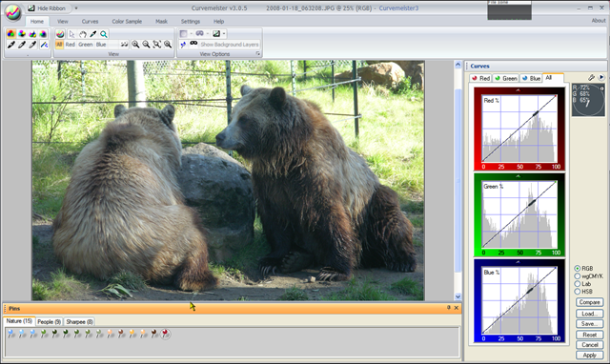
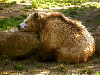
Another way to think of the role of color and contrast in RGB mode, is that color and contrast are like the proverbial Love and Marriage: you can't have one without the other. Likewise, variations in brightness cause variations in color - though they are subtle. The ever so thoroughly modern Lab splits these apart, and permits separate modification of Lightness and color, allowing you to control the texture of a surface, without necessarily affecting its color. Let's see how this plays out with a sample image of a bear that needs a boost.
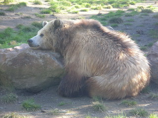
A contented, but low contrast, grizzly bear.
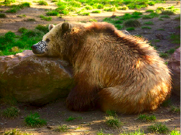
The same bear, after a diet of RGB curves (left) and Lab Curves (right).
The two images above show my efforts at adding contrast and color to the bear image, using Curvemeister in RGB and Lab mode. In both cases, "blue bears" being scarce on our particular planet, the bear's nose was set to neutral, removing the blue cast of the original. (BTW - I'd advise you to do the same experiment, and compare your own results).
Both of these images are acceptable, but in the RGB version I could only go so far in adjusting the contrast, because I was also required to keep from blowing out the colors in the bear's fur. This is not to say that you could not do better than this, and I invite you to make your own version of the bear image. [load original image]
![[load original image]](../ExtraChallenges/Grizzly/2008-01-18_062911.JPG)
Notice that in Lab mode, I was able to keep the texture in the bright spots of sun on the bear's fur, and add more texture (aka contrast), and color variation in the bears coat, and that the clumps of grass are much greener. Colors in general are saturated almost to the bursting point, simply because Lab allows color to be controlled independently of brightness.
Here are the curves that I used:
For the RGB curves I set a shadow point, cravenly using the RGB master curve. I then used Curvemeister's floating neutral feature to change the overall brightness of the image slightly, while retaining the neutral hue of the bear's snout.
In Lab mode, I started by creating a curve that adds a slight amount of contrast to the bear's fur. I then bumped the saturation by making the a and b channels steeper - in this case I added some extra oomph to the a channel to pump up the grass.
In both cases, I was careful to make the bear's snout a neutral or warm color. Blue is not an acceptable bear color. If you tackle this image, which is optional, be sure to use the hue clock to check the bear for blue areas. The RGB version looks about as good as the Lab one. I was able, very quickly and easily, to add more contrast and color using Lab than RGB, and that is an ability that can certainly come in handy with some of your images.
Example 5: Sun Moon Lake: This Time with Feeling (and Lab)
[right click and use "Save As" to access the full sized image]
Here's an image that is difficult to correct in RGB, and easy in Lab. See what you can do to bump the contrast and add color. Some things to look for are a temple in the upper right of the image that can be brought out of the shadows and the net of the fisherman on the boat should be red.
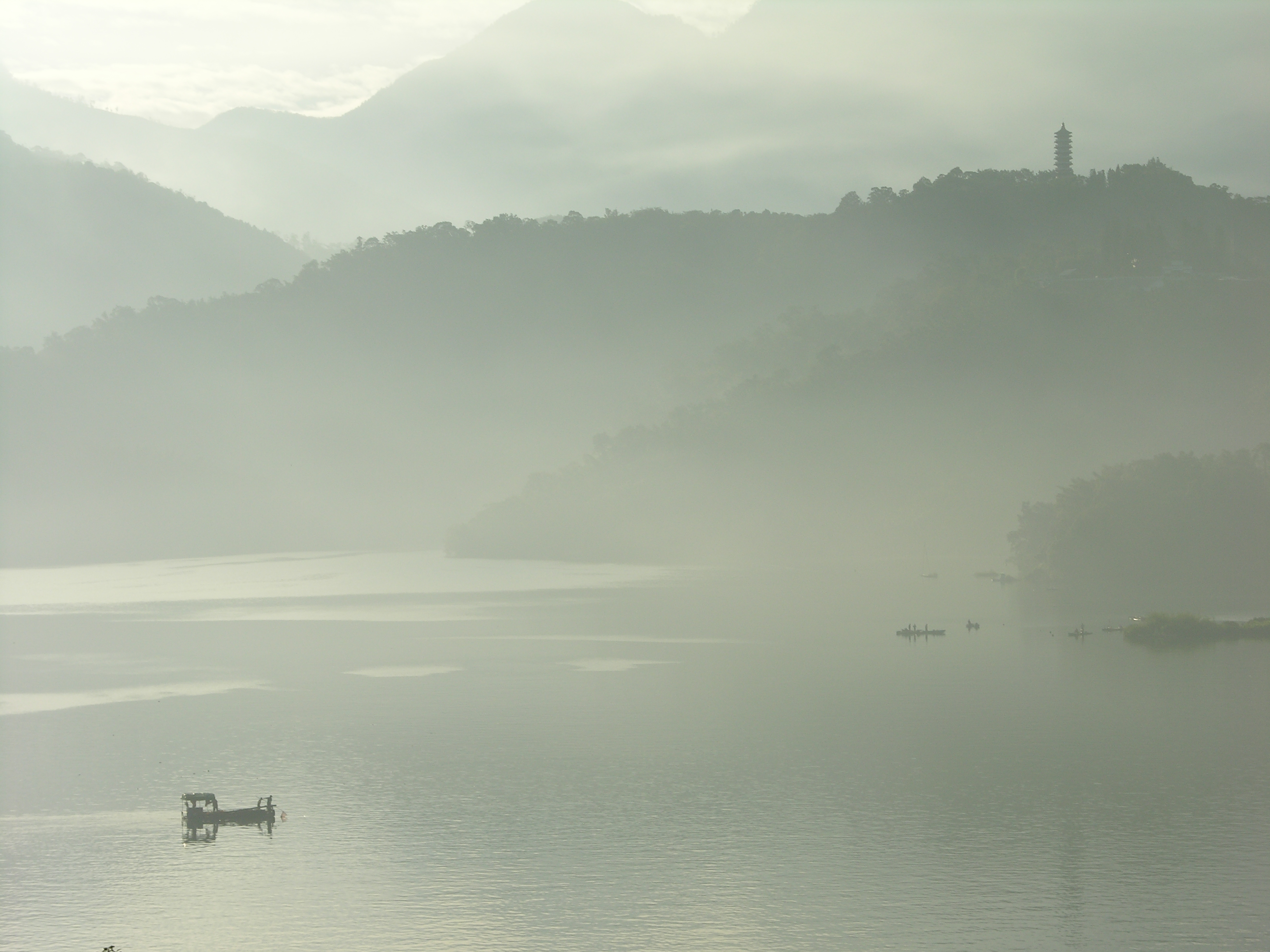
Example 6: Taroko Gorge- Shadow and Highlight, Finding a Neutral, and Removing a Cast
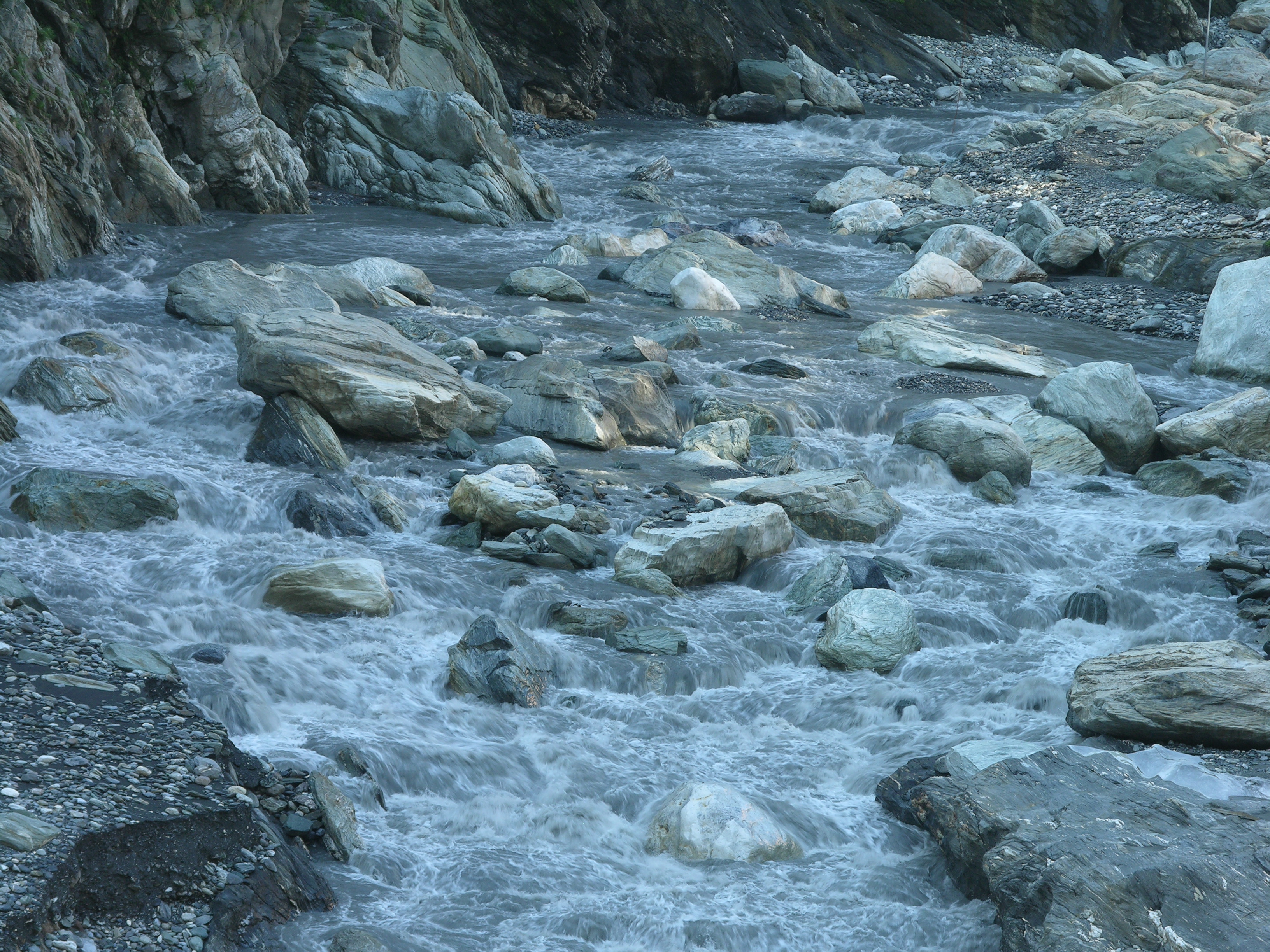
[right click and use "Save As" to access the full sized image]
This image has a severe color cast can you see an object in this image that you are sure is gray? Hint: not the rocks, they could be any color. Once you've found a neutral, pick a likely highlight and shadow - there is one of each in this image.
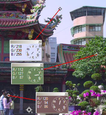
Using the Hue Clock to Correct a Neutral
In some cases you will need to take the reigns in hand, and adjust the curves manually in order to neutralize a color cast. The most common case for this is when there are several objects that should be neutral, and they have different color casts due to nearby reflecting objects, or other mixed lighting situations.
To set neutrals manually, alt click on each object, creating a hue clock for each one. Then adjust the curves so that the length of the hand in each hue clock is minimized. If you cannot make them all neutral, attempt to compromise. It is usually better to err on the side of making the color warmer (clock hand pointing upward) than colder.
Using Floating Neutrals to Control Overall Brightness
Floating neutrals are an innovation that ties the RGB channels together so that moving one curve causes the other two to move, maintaining the neutral's gray color. This greatly increases the versatility of the RGB color space, and makes it possible to maintain the neutrals while changing the overall brightness of the image. Color pins may also be floated, maintaining the hue of objects while altering their overall brightness.
Example 7: Angkor Thom. Floating Neutrals
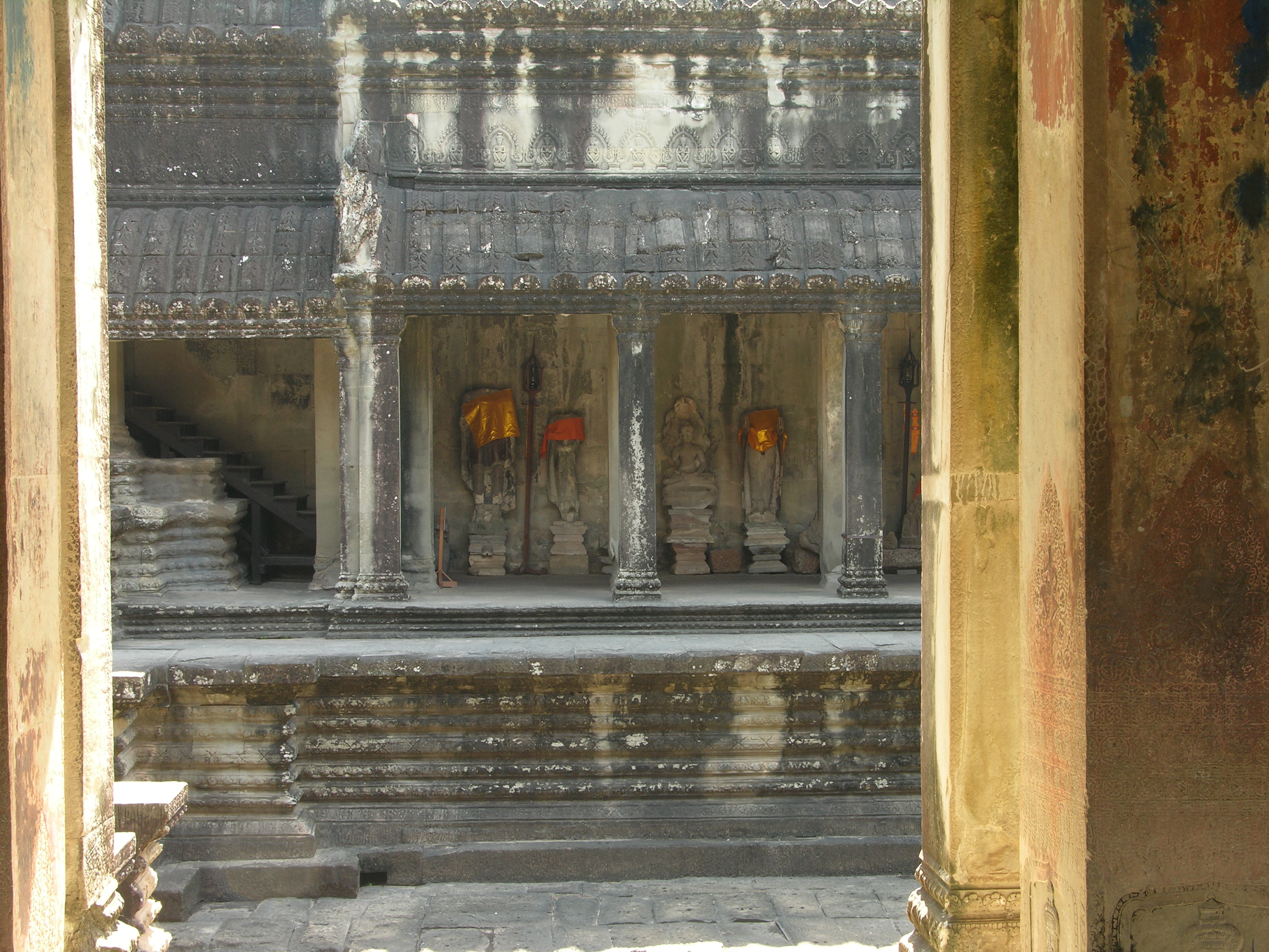
[right click and use "Save As" to access the full sized image]
![]() This example has a video hint.
This example has a video hint.
In RGB mode, set a shadow and highlight, using the threshold method. The walls in the foreground are not neutral, but most of the soot-covered stone in the background is. Then drop a neutral in the shaded area near one of the cloaked statues, and on the roof tiles about 3/4 of the way up the image. Now the fun part. Carefully drag the curve control points vertically on one of the channels - the three RGB curves will be tied together, and move in unison to maintain the neutral. This is a handy way to set a neutral, and adjust overall brightness, at the same time. See if you can get more vivid color and detail into the darker gray areas of the image. If you are fortunate, the orange silk cloaks will become more vivid as well. Try the same thing in Lab, and see which result you like better.
What a huge amount of information this week! Happy Curving!
|
 Site designed by Paradox Media |