This week the lesson touches on Color By The Numbers.
Attached to this posting you will find links to a few goodies for you to try out.
The first is a PDF document and an image.
The PDF is a walk through for color correction by the numbers using Curvemeister.
The PDF is here:
www.curvemeister.com/video/greg/color_correction_by_the_numbers.pdf
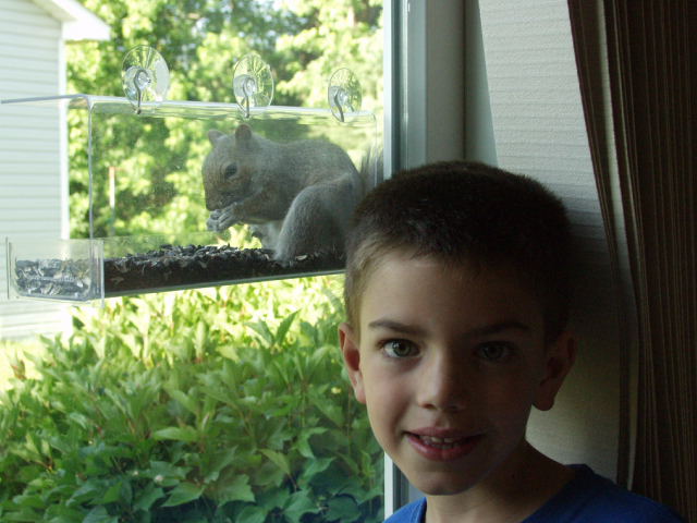
The image is here.
www.curvemeister.com/video/greg/dan_and_friend.JPG
Right Click and "save link as" should download it.
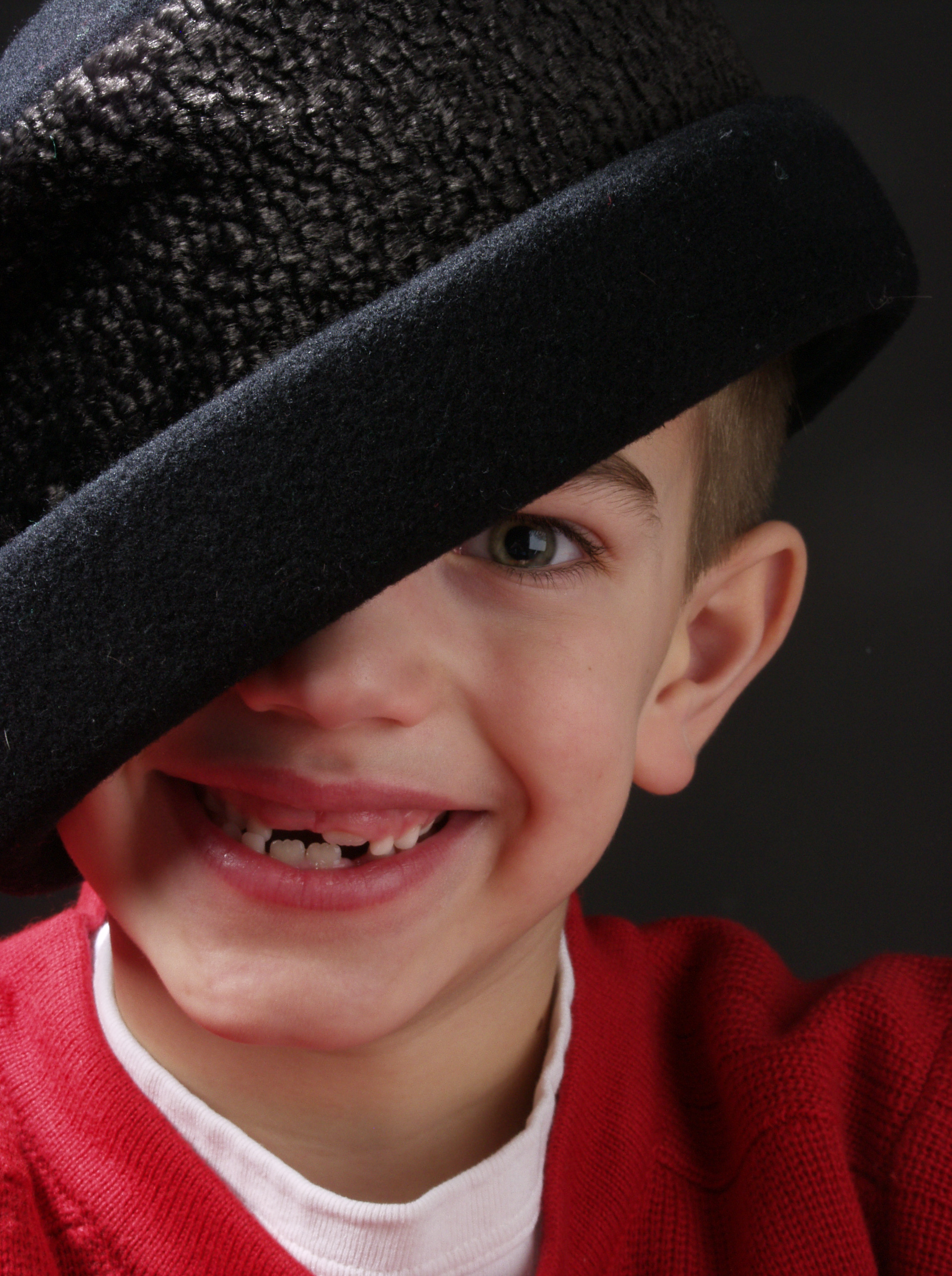
Next on the list is a short video of another color by the numbers correction and the image for you to use.
www.curvemeister.com/video/greg/rgb_btn.swf
and the image:
www.curvemeister.com/video/greg/Dan-Hat.jpg
Right Click and save link as should download it.
Happy Curving!
Greg
A Curvemeister Look at Color By The Numbers
-
mikemeister_admin
- Posts: 4927
- Joined: Fri Sep 20, 2013 8:29 pm
-
sjordan93436
- Posts: 462
- Joined: Sun Jul 11, 2010 4:23 am
- Contact:
-
mikemeister_admin
- Posts: 4927
- Joined: Fri Sep 20, 2013 8:29 pm
-
mikemeister_admin
- Posts: 4927
- Joined: Fri Sep 20, 2013 8:29 pm
Another thing, (sorry, I'm not picking on you), in the PDF file that describes correcting by the numbers, on the last page, page 6, at the very top, it says that to correct for the neutral, you need to find the average of the RGB numbers. In this PDF file, we are told to use the original RGB numbers....the ones on the left side of the hue clock, whereas in the video, we are told to use the after RGB numbers....the numbers on the right side of the hue clock. The video says that we need to use the after numbers since we have adjusted the points on the curves.
I just wanted make sure that no one got confused by that.
I just wanted make sure that no one got confused by that.
First of All...Sorry for any confusion...These things do evolve over time...Dan and Friend has been re-posted so you have the correct image.
When the video was made I strongly believed and taught; that the 1/4 and 3/4 tones were as far as I would ever want to send you to correct shadow and highlights. This was due to the fact that I was always looking for smooth transitions to no detail, and did not want to have clipping in those details. Now, I am seeing that images can hold up to the full range so long as I am not creating a blown highlight or blocked shadow when making those adjustments. My inkjet prints and commercial prints are holding that level of adjustment. The Computer screen is not able to hold the details that a print can...
As time went on I and others have found that it mattered less and less. As you can see both methods are effective. I will have to make a new video for the "Dan with the hat" to reflect the "current" thinking on this...
As for the average. Time and testing has shown that for the mid-tone neutral you really should average the new values because you have corrected the image some what and the changes reflect the tonal range and contrast as the image is after you set the highlight and shadows. The Idea is to hold the same tonal range as the original not necessarily move the tonal range with the correction since you are working on all channels.
As to the accuracy of the process. It is more accurate because it accounts for color cast in those areas. For instance if you have a image that you just want to get a print made fast and you are less concerned with completely accurate color. You can set the shadow threshold, set the highlight threshold and set a neutral. That will get you close but as you have seen in the Church pictures you can get a decent looking print that has blue shadows or Red highlights and depending on how it is printed they can get over exaggerated.
BTW I do not get yellow skin tones on the Dan and Friend...unless you were talking Dan with the hat.
Greg
When the video was made I strongly believed and taught; that the 1/4 and 3/4 tones were as far as I would ever want to send you to correct shadow and highlights. This was due to the fact that I was always looking for smooth transitions to no detail, and did not want to have clipping in those details. Now, I am seeing that images can hold up to the full range so long as I am not creating a blown highlight or blocked shadow when making those adjustments. My inkjet prints and commercial prints are holding that level of adjustment. The Computer screen is not able to hold the details that a print can...
As time went on I and others have found that it mattered less and less. As you can see both methods are effective. I will have to make a new video for the "Dan with the hat" to reflect the "current" thinking on this...
As for the average. Time and testing has shown that for the mid-tone neutral you really should average the new values because you have corrected the image some what and the changes reflect the tonal range and contrast as the image is after you set the highlight and shadows. The Idea is to hold the same tonal range as the original not necessarily move the tonal range with the correction since you are working on all channels.
As to the accuracy of the process. It is more accurate because it accounts for color cast in those
BTW I do not get yellow skin tones on the Dan and Friend...unless you were talking Dan with the hat.
Greg
- Attachments
-
- screenshot001-jpg-49 (204.05 KiB) Viewed 287927 times
Ok,
Shot 1 is a straight BTN correction. It certainly is pushing the limits on the skin tone but they are not "out of bounds" All that said Shot2 makes the skin a bit warmer and less sallow. I simply adjusted the Blue channel in the range that the skin tones are located.
Greg
Shot 1 is a straight BTN correction. It certainly is pushing the limits on the skin tone but they are not "out of bounds" All that said Shot2 makes the skin a bit warmer and less sallow. I simply adjusted the Blue channel in the range that the skin tones are located.
Greg
- Attachments
-
- screenshot003-jpg-19 (204 KiB) Viewed 287927 times
-
- screenshot004-jpg-13 (158.91 KiB) Viewed 287927 times
-
mikemeister_admin
- Posts: 4927
- Joined: Fri Sep 20, 2013 8:29 pm
Return to “Curvemeister 101 September 2010”
Who is online
Users browsing this forum: No registered users and 1 guest