 |
|||||||||
| |
|
|
|
|
|
|
|
|
|
Curvemeister 101: Week 3
Calibrating your Monitor and Printer
Color Correction "By the Numbers" What is it?
Color Correction “By the Numbers” Walkthrough for Curvemeister
Fixing Multiple Color Casts with RGB and the Hue Clock
Color Pins
Editing A Pin File
Pinning Skin Tones
Advanced Skin Tones Work Flow
Fixing Blue Shadows
Example 1: Cookie Image
Example 2 - Fruit Vendor revisited: Multiple Neutrals.
Example 3: 20 Skin Tones
Example 4: Skin Tones are not Just for People Anymore
Example 5: Berkeley Drummers, Borrowing from Peter to Pay Paula
Example 6: St Vitus Cathedral, Prague. Removing a Shadow Cast 1
Example 7: St Vitus Cathedral, Prague. Removing a Shadow Cast 2
Calibrating Your Monitor and Printer
This week we are going to tackle color; to do this you need to have a well calibrated monitor, and good judgment. Back in the days of CRT monitors, it was sufficient to run the Adobe Gamma (included with Photoshop and Elements) to get good color. The program adjusted the outputs for you. Adobe Gamma is still useful. It allows you to change the gamma and white point of your monitor. Unfortunately, the bar pattern used by Adobe Gamme does not work for LCD's, so for LCD Monitors if you have not calibrated before, you can follow this link to a decent website for LCD calibration tools and process.
Because LCD's have replaced CRTs as the dominant technology, my personal recommendation is that is color is critical you really need to move toward purchasing an instrument for calibrating your monitor.
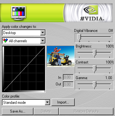
Most video cards provide their own adjustments for gamma, brightness, and color temperature.
If your card supports this, you may use it to adjust your monitor manually.
If you would prefer not to invest in color calibration equipment at this time, adjust your monitor's controls, or the display control panel so that you can see all of the distinct squares, particularly the lightest and darkest, of the step wedge pattern that appears at the bottom of this page (and all curvemeister.com pages).
![]()
Can you distinguish all 16 squares?
Without the shadow adjustment, which is the one that typically causes problems, you will tend to open up your shadows too much sacrificing contrast in the rest of your image. If you think about it, setting the range this way is like setting the "Highlight and Shadow" of your monitor. It turns out that your monitor has a neutral too, only it is called "color temperature" in this context.
In general, monitors are shipped with too high of a color temperature, and LCD's in particular are generally too bright. So lower the color temperature to 6500K or lower, either with an explicit setting in your display properties, or by adding a bit of red and green to the color adjustments. Also drop the brightness a notch or two from the maximum setting.
The Datacolor Spyder3, and the Xrite i1 2 display.
There are at least two instruments in the under $200 US price range that will do the job well. The Eye One Display 2 will do a good job of setting up your LCD, as will the Spyder 3 Pro. I use the Eye One Display 2 every two weeks on My LCD.
Your printer is an important link in the chain, and calibrating it correctly can be much more complex than setting up your monitor. Luckily, most printers print reasonably well out of the box, or with minimal fiddling with the adjustments. For those that don't. We have provided a test strip with instructions at the main Curvemeister website.
Photoshop presents its own, er, challenges when it comes to setting up your printer. Ian Lyons is an excellent photographer and teacher who has documented how to set up your color in Photoshop. His web site is well worth exploring.
Color Correction "By the Numbers"
The "by the numbers" philosophy has been developed by Dan Margulis over the years in his Professional Photoshop and "Photoshop Lab Color" books. It refers to a systematic method of correcting color by relying on numeric values as the first step when correcting colors in an image.
This process has several advantages, you can be confident of your result, it is repeatable even if there are color illusions built in to your image. Color blind individuals also benefit from correcting by the numbers, in the same way as the rest of us.
The big three, shadow, highlight, and neutral.
You have been correcting "by the numbers" already, when you set the shadow, highlight, and neutral. At this point in the class, you should be familiar with how to recognize whether a shadow, highlight, and neutral are appropriate for an image, locate them, and set them accordingly by right clicking at these locations and creating an appropriate adjustment point on the image. These "points" are actually examples of specialized color pins, which we'll be discussing shortly.
For example, by selecting RGB and creating a neutral on an object that you know is gray (but is not in the image), you are setting the color of that object to equal numeric values for red, green, and blue. Setting a shadow ensures that the darkest significant object in your image has some pixel values that are at the shadow point (RGB(0,0,0) by default), and likewise your highlight values are set to the highlight point (RGB(255,255,255) by default. That is working "by the numbers".
Let's compare "by the numbers" with the other popular alternative: adjusting the image by using your eyes only. In the case of a neutral, this means visually judging how gray the image is - a difficult process because the color cast may be very slight, and there may nearby colored objects in the image to confuse your eye. Setting a shadow point is also difficult; how will you visually judge when a particular area of the the image is pure black or for highlights pure white.
Once the basics have been put in place with the "big three" of shadow, highlight, and neutral, it is up to you to judge when the image has interesting contrast and color variation, and whether you have gone too far or not far enough with adding color to the image. "By the numbers" does not help you with this part of the color correction puzzle. What it does do is provide the bedrock for your subsequent visual adjustments. "By the numbers" is the key to making your colors as accurate and believable as possible.
A Color Correction “By the Numbers” Walkthrough for Curvemeister
Your goals for this process are to control the shadow, highlight, and a mid-tone colors. Preferably by finding a neutral to correct the color, and contrast of your image. For this example we will be using RGB as the color space.
Right Click and save the image to follow along with this walk through.
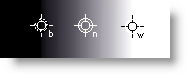
In CM you can create hue clocks by Alt-clicking on your image where you want to set the sample point. Choose a shadow area, a highlight area, and an area that should reasonably be neutral.
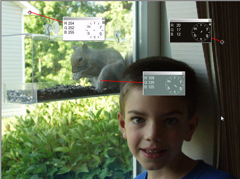
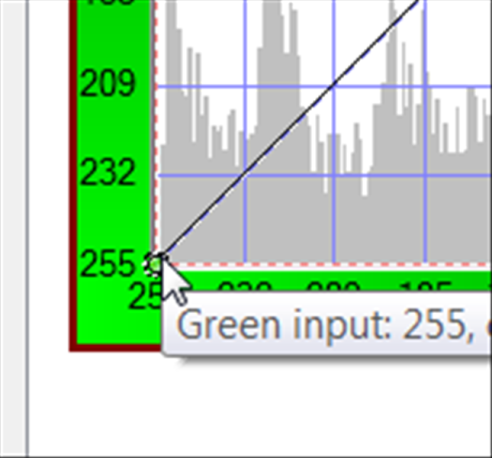
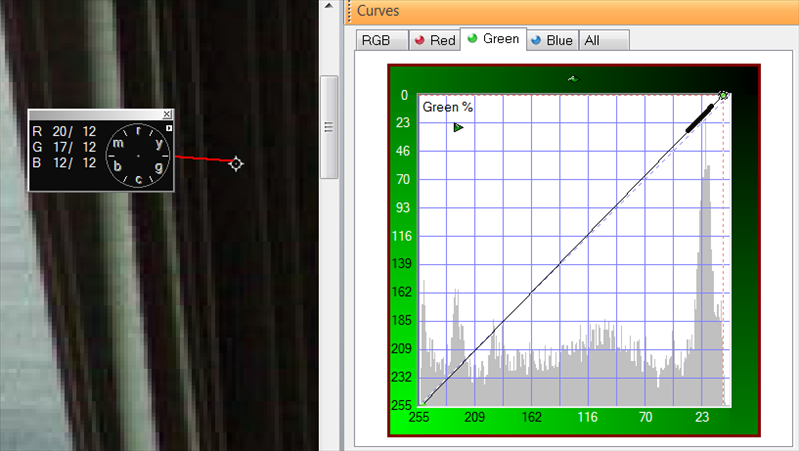
Let's start with the highlight:
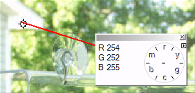
Notice that all the numbers on the hue clock are not equal. This means that there is a slight color cast to the highlight areas of the image. In this specific case it is a yellow green cast. The Hue clock is pointing to the space between the yellow and green markers on the clock and the green value is the one not matching.
- The information shown tells us that we have a slight color shift to the image in the highlights because the numbers are not all 255 or pure white.
- We will need to make a slight adjustment to the highlight parts of the R and G curves to adjust these values to be the same as the B value.
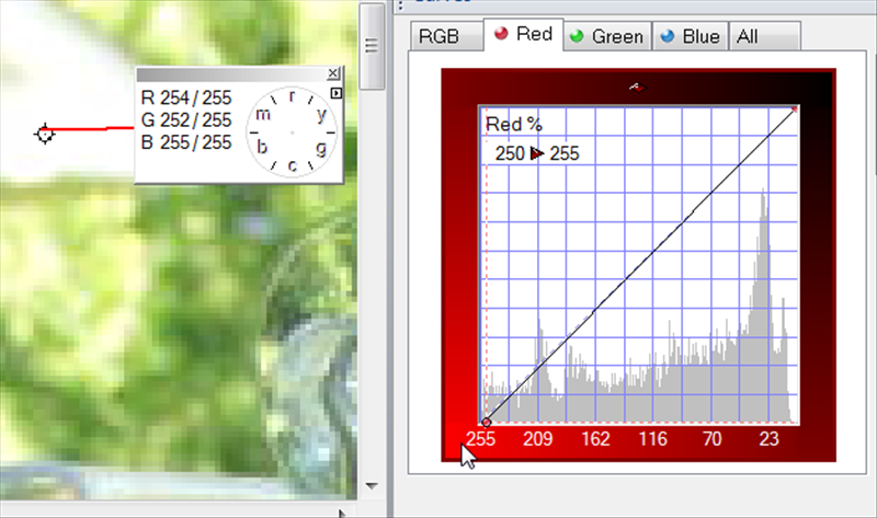
- Taking the G channel first:
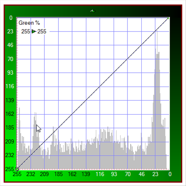
- The Highlight side of the curve is on the lower left.
- When you click on the corner your cursor will change to a 4 point arrow.
- Also notice the numbers in the upper Left corner. You can move them by single clicking on them if they are in your way.
Clicking on the corner sets an active control point on the curve and begins the adjustment. We will drag this point directly to the right and not up. This will change the value of the Green highlight value in RGB.
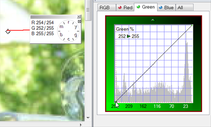
Note the Numbers have changed..you now have the original value/new value listed. Repeat the process on the R channel. All of the values should be the same to have a pure white highlight.
Now we need to do the same process for the shadow point we have chosen. This time pushing the shadows down to the lowest value but not necessarily down to zero.
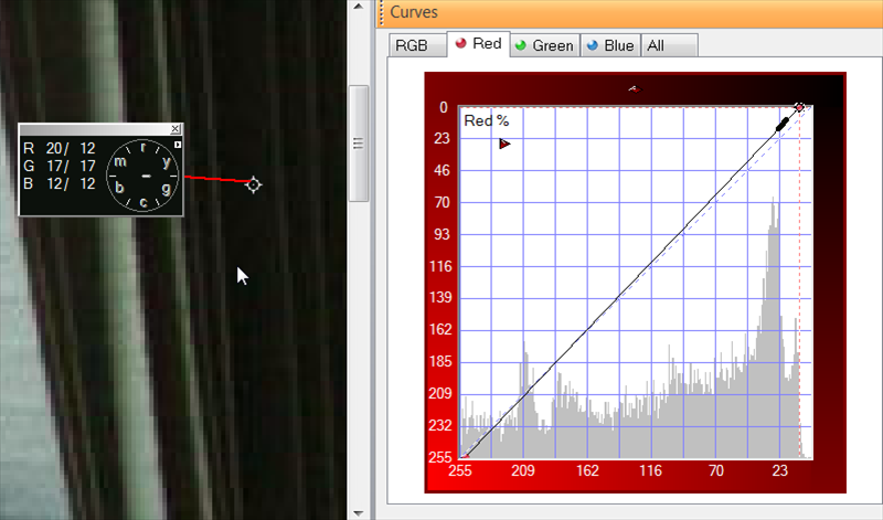
Notice that when we are done the hue clock arm has been reduced in length to a dot.
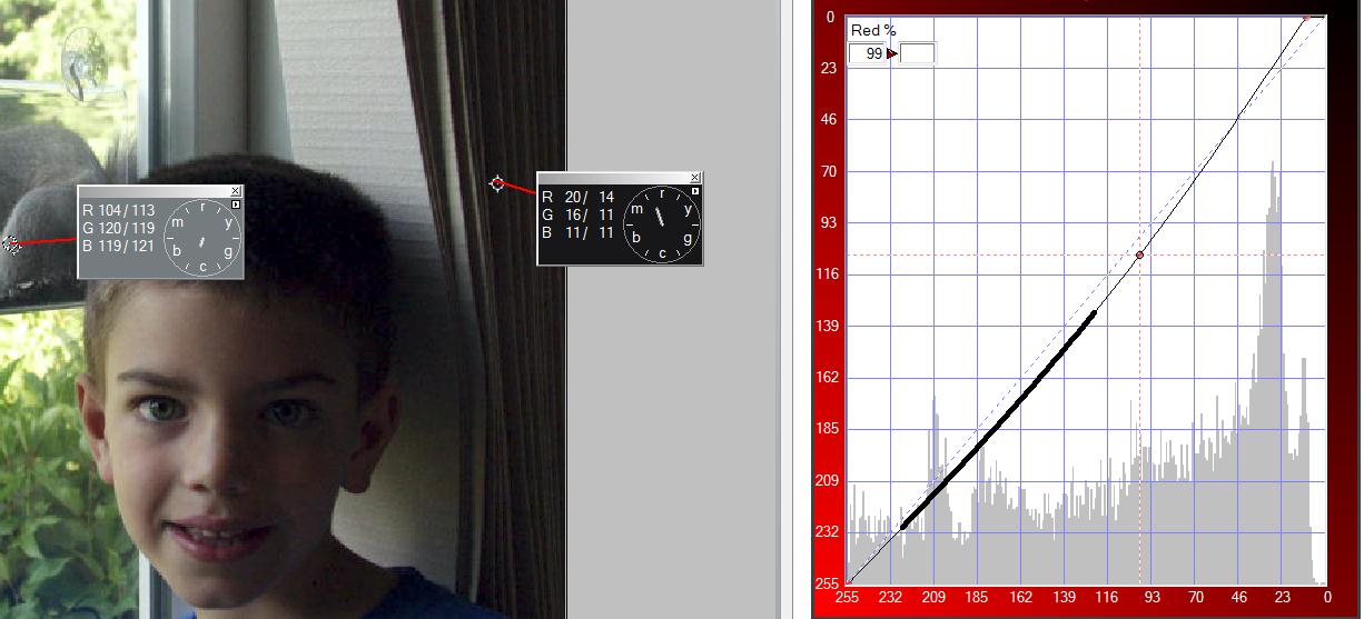
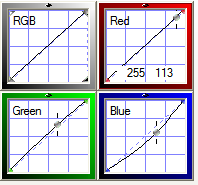
Now lets move onto the mid-tone. In this case we are fortunate that the midtone we chose is a possible neutral. We will try to find the correct brightness for this neutral to impact the overall brightness and contrast the least. Below is the Midtone hue clock we set. Notice that the numbers have changed. We will want to use the second set of numbers for our adjustment.
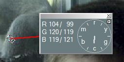
We start by finding the average of the three numbers listed here. 99+119+121=339. We now need to divide by 3 to get the average which is 113.
Start by finding the part of the Red curve where 99 is located. Add a control point to the curveline by clicking on it and then move that point using the up and down arrow keys until it has been moved to 113.
Repeat this process on the Green and Blue Channels as shown below.
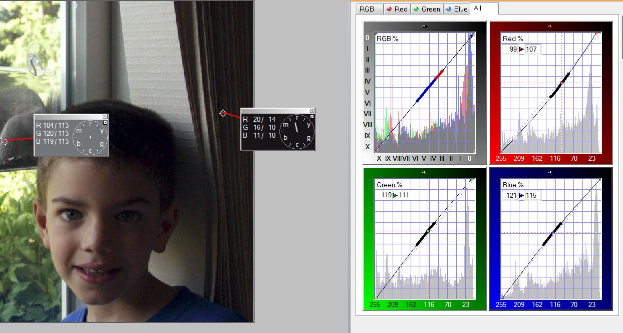
Once you have these settings completed you can use the composite curve of RGB to make final tonal adjustments or you can apply these changes to the image and return to Curvemeister for a second correction pass using LAB to make the tonal corrections you want.
Here is another image to try out and a video hint.
Click on the image and save to get the full resolution.
![]() I have provided a video to get you started.
I have provided a video to get you started.
Fixing Multiple Color Casts with RGB and the Hue Clock
Up to this point I've referred to the "color cast" of an image there were only one color cast. Most of the time this is a good working hypothesis, since an image generally has only one dominant color cast. Studio images are created with carefully controlled lighting, and generally do not suffer from the problem of multiple color casts.
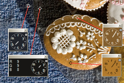
Example 1: Cookie Image
Studio images such as the one below are made with carefully controlled lighting, using matched light sources, screens, and reflectors to avoid color casts in the shadows. For this example there is no actual color correction. Your job for this example is to verify this for yourself, by alt-clicking in the shadowed and non-shadowed areas of each cookie (aka biscuit), noting that there is no variation in the hue from shadow to highlight. We will be dealing with less fortunate images for the remainder of the examples, and our goal will be to create this kind of color balance between light and shade.
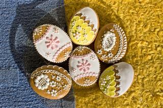
An image with no mixed lighting color cast issues.
[right click here to access the original image]
|
The hue clocks on the cookie on the right were created by alt-clicking on the image in Curvemeister. Note that there is no systematic drift toward blue or any other color. Curiosity item: the two hue clocks on the left show an exceptional situation in this image - going through the glass plate, the hue clock shows a yellow color cast. Any theories on what is causing this? Would this yellow cast be significant enough for you to attempt to correct, were you responsible for correcting this image? |
 |
Studio lighting aside, mere mortals, such as ourselves, must deal with multiple sources and colors of light, and the fact that objects reflect light on one another. So almost every image we create has many tiny color casts in addition to the dominant one. But not to worry, the problems are manageable.
The fruit vendor example below is a good example of an image with multiple color casts. Brushed stainless steel is one of the better neutrals you will ever find, but alt-clicking around the steel frame reveals a variety of colors on the hue clock.
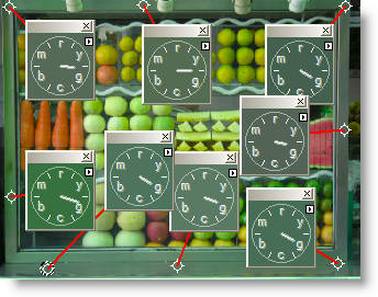
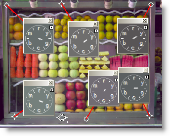
In this "wild world" image, the neutrals in the first image vary from green to yellow-green.
One compromise is shown in the second image: move the neutral around until the clock hands are as short as possible.
Example 2 - Fruit Vendor: Multiple Neutrals.
Can you get a set of neutrals similar to those shown above by using multiple neutrals in RGB? If you wish, you may take this exercise one step further by placing multiple hue clocks on the image, and modifying the curves manually.
[right click here to access the original image]
Color Pins
In Curvemeister you can create specific color "pins" (think Push Pins into a wall board) that allow you to access a variety of predefined colors for your images. You can create pins from any image and you can even create them from editing the text files behind the scenes.
A pin, in Curvemeister, is a sample point that takes a color value from an image and creates one or more control points on a curve(s). Pins always modify curves, and they do so by adding control points to curves. You'll see how this works in the next section.
Curvemeister provides a number of pins by default, and there is a library of pins, located in the Goodies folder,(On my system they are located in the local folder C:\ProgramData\Curvemeister.com\Curvemeister3-64\Swatches) that you can add to your working set. Copy the Text files from the Goodies Folder to the Swatches folder and re-open Curvemeister.
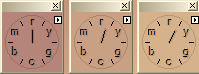
To show the pin palette, click on the pin icon in the command bar. This icon is also available in the Home Tab of the ribbon bar |
 |
|
|
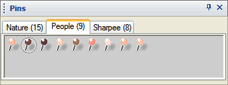
The pin palette is now visible. To use a pin, click on it and drag it onto the image, just as you did with shadow, highlight and neutral. Notice that there is a tab for each set of pins. You can add new tabs by copying new pin files into the Swatches folder. |
![[right click here to access the original image]](images/egg_shaped_cookies.jpg)
Editing a Pin File:
If you right click on the pin pallet you will get a flyout menu that has the entries to edit pins.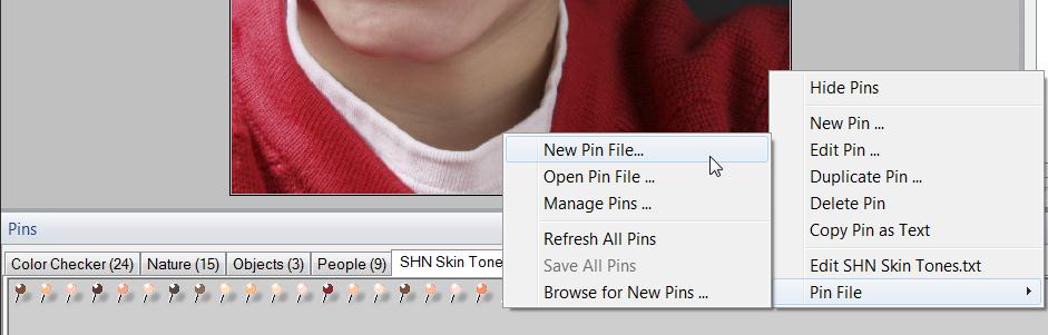
If you open a pins file you will see that they consist of plain text. This file can be edited and as long as you use the same format for the lines you can edit the pins as needed. Feel free to create your own set of Pins or share them out to the pins thread on the Curvemeister forum.
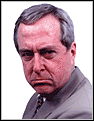
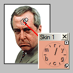
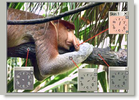
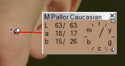
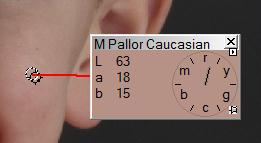
Pinning a Skin Tone
Here's an example of a skin tone pin, in use, on an actual news image gleaned from the web.
 |
+ |
 |
= |
 |
the man's hair is a more accurate color. Sadly, his expression is unchanged.
The Big Three: shadow, highlight, and neutral are pins. Probably the most commonly used pins, after the big three, are skin tone pins, and of the skin tones. Let's look at some examples of skin tone pins in action. Keep in mind the distinction between a pin, and a curve control point. Pins will not allow you to move them. They are "stuck to the curve at the points you have chosen; Control Points can be moved and changed.
I generally prefer to rely on the hue clock to set skin tones, preferring to manually move the curves to achieve a good compromise. If you are correcting a large number of people images, it is very efficient to simply drag a skin tone pin to the right place, and blam!, you're ready to color correct the next image.
Example 3: 20 Skin Tones
For this exercise, select each of the 20 images one at a time with the marquee tool, start curvemeister, and drag the Skin 1 pin to each skin tone. Repeat this for each image, with the whole process taking about two minutes. When you select part of the image in Photoshop Curvemeister will only adjust the area in the selection.
![]() I have provided a video to get you started.
I have provided a video to get you started.
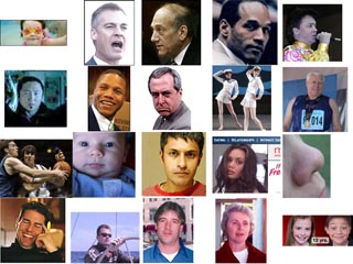
20 skin tones that need your help.![]() see video
see video
[right click here to access the original image]
![[right click here to access the original image]](images/20-bad-skin-tones.jpg)
Skin tones with the Hue Clock
Pins can be very useful when the only important color in the image is a skin tone. In other cases, it will be necessary to alt-click to create a hue clock, and then move the curves, or even other pins, to make the hue clock point to the nominal "noon to 1 o'clock" position that indicates a good skin tone. If you're going to be making these kinds of compromises, t's important to be able to recognize a good skin tone using the hue clock. If you know when lunch hour is (and who isn't attuned to this fine time of day), you are set for skin tones.
Good skin tones are anywhere between 12:00 to 1:00 on the clock, lunch hour.
The position of the hand is the most important part of the equation. Too far to the left, and people look like they've been holding their breath too long. To far to the right, and they look sick.
The length of the hand indicates saturation. It should be about the length of an hour hand. Shorter than this, and the colors are becoming too subtle, much longer, and the skin tone will take on a vivid red or orange look.
Example 4: Skin Tones are not Just for People Anymore
Evolution being what it is, a large number of animals share the same skin tone that we have. This image has a skin tone, as well as a yellow-green cast.
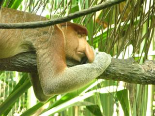
Correct this skin tone using the hue clock, and keeping
the tree limb and gray forearm close to neutral. Remember that the S/H/N all need to be set first or else the "Skin Pin" will throw the colors all out of sorts.
[right click here to access the original image]
![[right click here to access the original image]](images/2007-12-03_095938.JPG)
 In this exercise, you'll start by pinning the skin tone of the animal's face, and fine tune the position of the pin so that it is on a reasonably saturated area of skin. Then click the unlock button at the bottom right corner of the sample palette.
Sample Pinned:
Sample Un-Pinned: Notice the pushpin Icon in the lower right of the hue clock.
Next alt-click on the forearm, and the light and dark areas of the branch to create more Floating Hue Clocks.
Start by using Lab for this correction. For the color portion of your work, only change the end points of the a and b curves. You may alter the Lightness curve in any way you like, to bring out the texture of the fur and wood as well as controlling the brighter parts of the image. Your final image should look something like the image on the above, with particular emphasis on the neutral points and, of course, the skin tone.
If you like, you can do this image in two separate passes. Start in RGB, to remove the color cast. Then click Ok, start Curvemeister again and use wgCMYK. Do not use HSB for the first pass, because it is not possible to remove a color cast in that color space.
Example 5: Berkeley Drummers, Borrowing from Peter to Pay Paula
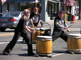
This image contains a range of skin tones, as well as mixed sun/shadow lighting.
[right click here to access the original image]
![[right click here to access the original image]](images/2005-09-25-111823.jpg)
For this image, start by placing a neutral on the asphalt pavement (almost always a good neutral), and alt click on each of the faces to create a hue clock for each one. Working in Lab, modify the a and b curves manually to get each of the three skin tones within the "lunch hour" range discussed earlier. You should only need to move the end points of the a and b curves.
For extra credit, see if you can remove some or all of the blue color cast in the shadows - this will probably require a separate pass in RGB mode.
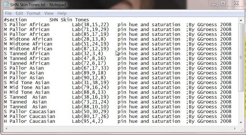
ADVANCED SKIN TONES WORK FLOW
Here is a link to a PDF document describing an advanced skin tones workflow. You will also want to download the "SHN Skin Tones" pin file from the Curvemeister forum thread on color pins.
Right Click and save this image file to follow along
Fixing Blue Shadows
The systematic change of color from sun to shade is a problem that is as old as color photography itself. Although you always have the option to retain such a color cast for artistic reasons, in this class I will always focus on the ability to remove such a cast as completely as possible, in effect recreating controlled studio lighting in an uncontrolled outdoor, or other mixed light, setting.
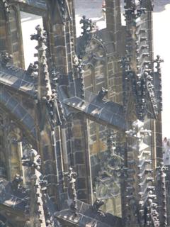
Example 6: St Vitus Cathedral, Prague. Removing a Shadow Cast 1
This image has a strong blue shadow cast that increases from right to left.
[right click here to access the original image]
![[right click here to access the original image]](images/2005-08-31-010943.JPG)
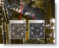
Alt click on the image in Curvemeister to create hue clocks as shown below. Working in RGB, move the dark end (normally lower left corner) of the blue curve inward, horizontally to try to get the green hue clocks to match as closely as possible. Notice that you can also move the other end of the blue curve in. Juggle the adjustment until you get something like the image shown below.
The blue hue clock on the left is important. There is no need to change the hue of the sky. If you do change it, blue skies should be just on the cyan side of blue, and never on the magenta side.
Example 7: St Vitus Cathedral, Prague. Removing a Shadow Cast 2
This image needs a shadow point, and also has a blue cast in the shadows.
[right click here to access the original image]
![[right click here to access the original image]](images/2005-08-31-010915.JPG)
|
This image has the same problem with blue shadows, and needs additional help with a shadow point. In fact, you'll need to take care of the shadow point first, click apply, and come back in to Curvemeister to fix the blue cast (why is this necessary). On your second pass, use RGB, and remove the color cast by manipulating both the blue and green curves, so that the hue clocks look something like those shown here. A third and final pass in Lab is suggested to bump the colors and contrast. I encourage you to take your own tack and see if you can remove the color cast, and get a different, perhaps better, result than the one shown here. |
 |
That's the session for this week - I look for your comments in the class forum, and hope this will keep you busy, and get you thinking about some of the concepts behind "by the numbers". If you are curious about exploring any of the concepts presented here in more depth, check out any book by Dan Margulis.
|
 Site designed by Paradox Media |