 |
|||||||||
| |
|
|
|
|
|
|
|
|
|
Curvemeister 101: Week 1
Welcome to the Class
Installing Curvemeister
The Color Wizard: A Dark Day in Duck-Land
How Curves Work
Exercise Examples 1 through 8
Video Hints
Welcome to the Class
Welcome to the Curvemeister class. This class is about improving the color of your photographs by modifying color and contrast, and how to use curves to change them, and make your images look better. Although Curvemeister will be used throughout this class, the principles you learn can be applied to any program that supports curves, particularly if that program offers access to individual color channels.
Remember, tthat your participation in the class discussions are important. Ask your own questions, and comment on and help with the questions other people ask. Everyone likes a compliment, so please comment on other people's work early and often.
If you're like most people, you've already started your color correction career by using some of the automated tools provided in Photoshop Elements or Photoshop - these include auto levels, auto color, and auto contrast. There is another group of tools that have been found to be very useful for beginners and experienced people. These include Fill Flash, Shadow and Highlight, Variations, and many others. The Levels tool is another excellent color adjustment. At the core of each of these tools, without exception, beats a heart made of pure curves, with a dab of masking thrown in, and that heart is what this class is all about. Once you understand curves, you'll find that many of the other color correction tools I mentioned will no longer be interesting to you, since they do less than curves can.
Other tools will remain powerful allies in your quest for good color, and using the principles of color and contrast that you learn in this class will make these tools easier to understand and use.
Curves are so important, and so powerful, that some people come away from this class with the impression that they are the only important way to correct your images. This is not the case! It's important to know that there are other areas of photography and digital image manipulation that do not involve curves, and are very important to creating any good image.
Since most of the class is using Elements, I will use Elements as a shorthand to refer to both Elements and Photoshop.
Once again, welcome! Now it's time to get started.
Installing Curvemeister
First some basic preparation. If you have not done so already, You may install the demo version of Curvemeister from the Curvemeister site. There are instructions there that will get you started with the install. If you do run into problems, post to the class discussion area and someone will help. Curvemeister will install on just about any vesion of Photoshop or Elements, going back to Windows 98, Elements 1, and Photoshop 5.5.
If you already have Curvemeister 3, there is or course no need to install the demo.
The Color Wizard: How to Brighten Up a Photograph, or: A Dark Day in Duck-Land
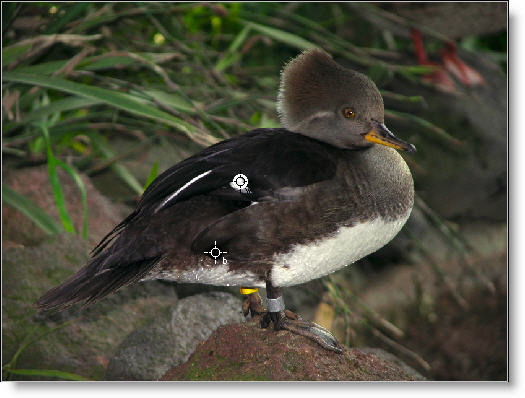
 After adjustment |
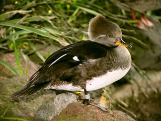
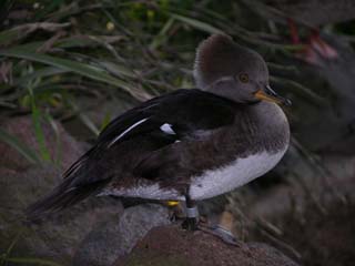
Let's dive in and try an example, using the under-exposed duck image shown above. The wizard is a great way to get started with the three most important ingredients of the color correction by the numbers recipe: shadow, highlight, and neutral.
Here is the curve that we will be building, step by step, using the wizard. Many people use the Wizard at their jumping off point for all of their images, even after they are familiar with using curves directly.
As an extra exercise, I suggest that at this point you download the original image, and follow each step as you follow the material.
Starting Curvemeister
Curvemeister runs under Elements as a plugin. To run Curvemeister, first start Elements, then open the duck image you downloaded previosly. Then select Curvemeister 3 from the filters menu. If the wizard screen comes up immediately, skip to the next paragraph. Otherwise, look under the "Home" tab in the area at the top of the screen, and click the button with the blue magic wand (see right), or hold the control key down and press W.
You'll see the Welcome to the Wizard, screen. Although you do not control the image from this screen, there are two things to notice:
-
There is a "Help" button that will take you to the appropriate manual page to review the concepts behind what you are seeing. Use this button if you would like a refresher on any of the steps in the Wizard.
-
When you decide graduate yourself from always starting off with the Wizard, put a check mark in the "Do not start" box.
Click the Next button to go to the Color Space Selection window.
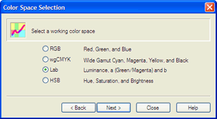
Select the Color Space
At this point you're being asked to select a color space in which you want to work. It's a little early to dive into the concept of a color space - that happens soon enough though. Here's one way to think of it. Wood splits better when you split with the grain. The colors in a photograph, have a grain too, and picking your color space amounts to rotating the colors in a different orientation, the better to curve them. Most images will split nicely in Lab, while others work better in RGB, HSB, or wgCMYK. For the time being, I suggest you pick between RGB or Lab.
|
There are at least two reasons why Lab is the easiest color space to learn in. This is because you can modify the contrast and brightness of an Lab image without changing the colors. The opposite is true too: you can change colors around, dramatically, without changing the contrast of the image. This not only makes Lab a natural for people who are just starting out, but many professionals stick with Lab as their preferred color space. So click on Lab for now. It's a major feature of Curvemeister is that you can easily change your mind about which color space you want to use, and we'll demonstrate that by switching to RGB at the end to compare results. Curious? Go ahead and click on wgCMYK and HSB, just to see what they look like. These two color spaces have some interesting properties that we'll explore later on in the class. Click Next. |
|
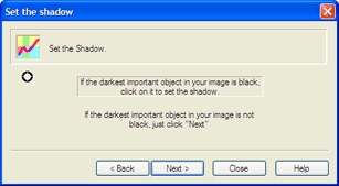
Set the ShadowYou are now being asked to decide whether your image has a shadow.. A shadow, or shadow point means an area of interest that is almost black, contains texture information, and little or no color. Not all images have a shadow. In the case of the duck image, the happens to be a shadow. Ok, so there is a shadow point, let's discuss how to find the shadow point. |
 The wizard's shadow point window. |
Since the shadow point is an area of interest, It will never be in the background, in any out of focus areas of the image, or on any Note: In Lab mode, we sometimes ignore the requirement that the shadow have no color, and allow the shadow point to be located on colored objects.very tiny objects. It will almost always be in an area where the viewer will look, even briefly, for detail or texture. An example of this would be the tuxedo of the groom at a wedding, or the fur in a picture of a black cat. You want these to be as dark as possible, but not pure black because that would rob them of any texture variation, and make them (the groom or the cat) take on an unnatural flat appearance.
Keeping this in mind, and t aking a look at the duck image, there are some dark feather's on it's back, and some of them are very close to black. To select the shadow point, click on the duck's back with the mouse. This creates the shadow point, which will look like a small circle at the center of a plus sign.
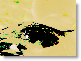 Click and drag on the shadow point, and you'll see a sudden change in the image, with most of the image going gray or yellow, and other areas showing as pure black (see left). This method of display is called threshold mode and is designed to make it easier for you to precisely locate the shadow point.
There are quite a few pure black areas in the threshold image. This means that the shadow point is in need of some fine tuning. Drag the cross hairs around until you create as tiny an island of black as possible. Once you get the hang of it, locating the shadow point is usually a matter of a few seconds of dragging.
The final postion of the black point is shown below, indicated by the red arrow. It is well below and to the left of our original starting point. Ideally, you will see only a few specks of pure black remaining on any important area of the image.
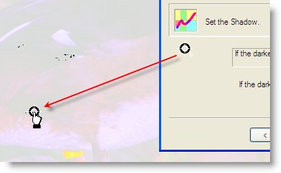
The final shadow point location
Set the Highlight
A highlight is the opposite of a shadow. It is an area of near white that contains detail and no color. Taken together, setting the shadow and highlight determine the dynamic range that is available to the entire image. Setting the shadow and highlight are threfore the most important things that we, as curvemeisters, can do to improve an image.
Pure reflective areas, 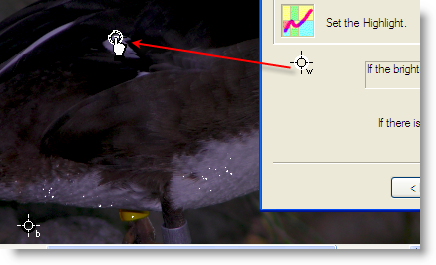 such as the bright white specks of water on the bird's belly, are called specular highlights. Although they are white, and are located on the object of interest, the droplets don't count because they do not contain any detail. Likewise, if there were areas of pure white in the background, you would ignore them because they are not an object of interest.
Remember the highlight must be free of color. This means you should ignore any colored areas, even if they are part of the object of interest, and brighter than any other parts of the image. A highlight must be free of color, though this restriction can be relaxed somewhat in Lab mode.
![]() See the Video Hints
See the Video Hints
At this point, the image is looking a little better. Setting the highlight is definitely a step in the right direction.
After you click next, the Wizard will ask if your image has any skin tones. Obviously, there are none in this image, so click Next again to go to the Wizard's Set Neutral window.
Set the Neutral
![]() See the Video Hints
See the Video Hints
Nearly every image taken outside of a studio has a color cast. Setting a neutral is the most powerful method available for getting rid of a color cast. It is also one of the most subjective aspects; Your judgement and perception have a lot to add to this process. Finding a neutral is usually done by finding an object in the image that your experience says should be gray, but is not gray in the image.
Objects that are normally free of color are: pavement, including sidewalks and macadam or asphalt roadways, newsprint, magazines, white shirts and other clothing, burnished white metals including steel, aluminum, and nickle, computers, household appliances, edges of books, slate roofs, weatherd wood, and car tires. Look around for a minute, and you'll find an equally long list of objects that are always, or nearly always, free of color.
Note: When there is no neutral, it's no fair guessing. Use will-power and simply pass on to the next step of the wizard. Much later we'll look at ways to deduce, using the clues provided by impossible colors, like Sherlock Holmes, and determine what the color cast of an image might be.For example, if you have a picture of a bride and groom, the bride's dress, as well as the groom's shirt, are almost always excellent neutrals. If these objects are ever so slightly blue, red, purple, or any other color, you have a color cast, and it's time to set a neutral on one of these areas of the image to get rid of the neutral.
Back to our duck image. Although we might be tempted to choose the grayish stone just behind the duck as a neutral, there is no need to do so. The zoo keeper has thoughtfully placed a band of aluminum around the bird's right leg, and we can happily use that as our neutral.
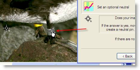
Setting the neutral point on the bird's aluminum leg band.
Adjust the Overall Brightness and Color Intensity
In the wizard, we can change the overall brightness of the image by adjusting one slider. In Lab mode, we have a second slider that we may also increase or decrease the amount of color in the image. Generally, as curvemeisters, we are naturally inclined to get as much color into an image as we can get away with (but no more!).
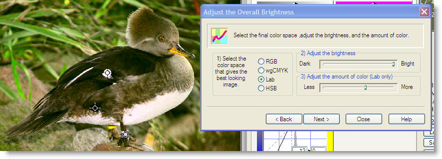
When adjusting the overall brightness, always stop short of removing detail and texture from the brighter areas of the image, even if this means settling for less detail in the darker parts. In this case, if the slider had not topped out on me, I would normally have liked to to open up the areas of darker feathers on the duck's back. This is probably just as well, because the lighter feathers were just about to lose detail anyway. In the next lesson, we can have our cake and eat it too, by using different curve shapes to actually add detail to bright areas and dark areas at the same time.
Certainly the image looks much better than the original, which was just one step away from going to bit heaven to save disk space. Click on RGB mode, and adjust the brightness slider, and see if you like the result in that color space better.
We will revisit this image later, and see what we can do once we are out of the Wizard and using curves more directly.
Click the Finish button to return to Elements with your changes, and save your work..
Assignment: do this exercise in RGB mode, and see if you can match the result in Lab mode. Decide whether the Lab version or the RGB version is better, and explain why when you post to the class.
You probably noticed, in the previous section, that we didn't use curves directly. Instead we dropped shadow, highlight, and neutral points on the image, and used a slider to adjust the overall brigthness of the image. In the next section, we'll take a closer look at how curves work.
How Curves Work
 Let's start with a black and white image, shown here, of a white numeral "1" against a gray background. Our goal is to make the background pure black, while keeping the numeral 1 pure white, a pixel value of 255. In the wizard, this would be easy - set a shadow on the gray part of the image (making it black) and a highlight on the "1" (making it white). You are invited to save the original image to a folder, and open it in Elements as you follow along.
As an exercise, let's pretend that we don't have the this automated capability at our disposal. How would we get the job done by directly changing the curves. I happen to know that the gray area, has a value of 184. Our job, then, is to convert 184 to 0.
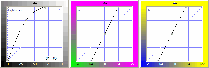
Now let's take a look at whatthe different parts of the curve display mean. Specifically, we'll be looking at the the curve itself, the horizontal axes of the curve, and what the numbers in one corner mean, as you move the cursor over the curve window. As luck would have it, we have an image of exactly that, just below and to the right. 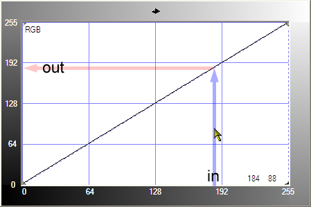
The numbers along the left and bottom edges indicate color values, which in the case of our images may be thought of as gray values. Usually, Curvemeister will shade the edges of the graph, since you are allowed to flip the axis by clicking on the diamond shape in the upper center of the curve, black can be on the other side. The line running from the lower left to the upper right corner is the curve, which right now is not much of a curve at all. Think of a particular color value, in this case 184, and a car driving upward from the bottom from that location, along the gray arrow marked with the word in. When the car hits the line, it runs out of gas and turns left, and the location it lands on the vertical axis, marked out, is the new color value. When the curve is a perfect straight line like this, it does not change values. This is boring. Let's see what happens when we change the shape of the curve.
See where the gold colored cursor is located? We actually know its position precisely, in terms of color values, because this is indicated by the numbers in the bottom right corner of the curve window: 184, 88. These are the in and out color values that would apply, if the curve were dragged to that point. To do this, we click and drag on the curve, and then fine tune the location until our numbers match 188 and 88. This takes just a second, so let's do it. While we're at it, we'll see what this does to our test image.
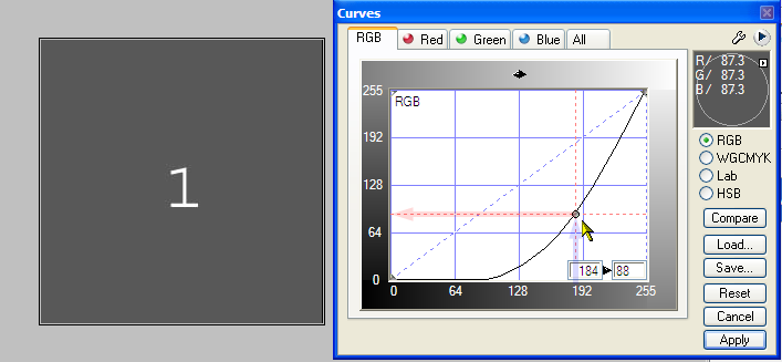
A different curve shape, and the resulting darker image.
The numbers in the lower right corner of the curve window are now enclosed in a double border. This indicates two things about the numbers. First, they no longer refer to the location of the cursor. Instead they indicate the location of the selected curve control point , 184 and 88. This curve point has vertical and horizontal dotted lines that carry the in and out values to the edges of the graph. The second thing about these numbers is that you can click on them and type into them, which is preferable to moving the mouse in some situations.
Now picture where our car would wind up if it drove vertically. When it hits the line and turns left, it will wind up at a lower, darker number. That's exactly what happens with our image - the value 188 is now a dark gray color, instead of a light gray.
Now, back to our original job, which is to make the background completely black. The obvious way to do this is simply to drag the control point downward until it reaches zero, or type a zero into the right hand number. Sounds good. Here's what the curve, and image look like, when you do this.
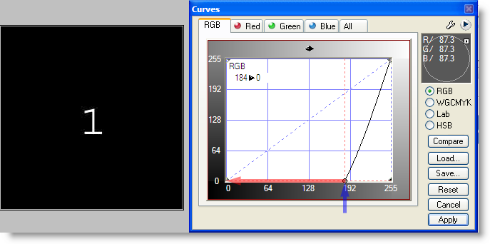
Done! - a black background.
So, with a very simple example, we've seen what the numbers along the axis of the curve mean, how the shape of the curve affects the image, how to create and modify a control point, and how to use a numerical value to set a perfect black point.
Additional Information is Available here: Understanding the Curves Interface
Example 1
![]() See the Video Hints
See the Video Hints
|
|
Example 2
|
Similar, except that this time the number is gray, and needs to be made white. Try this by moving the upper right corner of the curve, until the number becomes visibly white. See how close you were by right clicking on the interior of the number 2, and creating a highlight. Drag the highlight point just onto the edge of the 2. Notice that the 2 takes on a harsh, jaggy appearance? This is an example of locating the highlight point incorrectly, so that detail is lost in the brightest areas of the image - in this case where the edge of the 2 meets the black background. |

Example 3
|
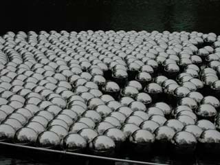
This photograph is very similar to one of the first two examples, in that either it's blacks or whites (not both) need to be cleaned up. Your job is to decide which of the two is needed. Fix it by moving one end of the curve, or by right clicking to place a single highlight or shadow point. There is color in this image so watch for it to become more visable. Keep an eye on the highlight details in the spheres. We want full control over the details and maybe even some color. |
Example 4
|
This photograph suffers from insufficient contrast. You may improve it by combining the techniques you uese in examples 1 and 2. There is more that can be done to improve the colors in this image Try to find a reasonable neutral point and see if you can warm up the image. |
Example 5
|
This photograph can be improved by increasing contrast and saturation. Since there are no pure black or white objects in this image, only using the threshold control to adjust both the dark and light extremes of the image will get you a long way into the correction. There might be a few places that could be used as a neutral.
|
Example 6
|
Try doing the same things you did for Example 5, but more so, for even more increase in contrast in color. The sky is not necessarily Blue for this image. |
Example 7
|
c01s01-Example7.jpg is a combination of the first two examples in this class. Setting the highlight and shadow will not help, because there is already important detail that is pure black and white. Can you find a compromise curve that improves the contrast of both numbers? Hint: the curve will have the shape of a backward S. |

Example 8
|
c01s01-Example8.jpg presents the sameproblem as the previous example, just a little more extreme. Text your curve bending skills to make both the 1 and the 2 as clearly readable as possible. |

![[right click here and use your browser to save the original]](images/2007-01-23_145313-duck.JPG)
![[original image]](images/c01s01-Example3.JPG)
![[original image]](images/c01s01-Example4.JPG)
![[original image]](images/c01s01-Example5.jpg)
![[original image]](images/c01s01-Example6.JPG)
![]() See the Video Hints
See the Video Hints
ADVANCED USERS!
If you would like to try an advanced exercise use one of the following underexposed images as a starting point. You'll need to step outside of the wizard because these images are darker, and you'll need to stretch the curve manually to get a bright enough image. The second image will require that you make the sky color correct, and that you get detail into the shadows.
Here are some more advanced images for you to experiment with.
If you decide to tackle them now, you will need to exit the wizard and start bending curves manually. Right click on an image, and use your browser's Save command to get the original full-sized image.
|
 Site designed by Paradox Media |