 |
|||||||||
| |
|
|
|
|
|
|
|
|
|
Week 1 Hints
|
These hints will give you a few clues on how to do the exercises. I'll be showing you a sample of what the curve will look like, and which curves you can modify, and it's up to you to make a judgement about the exact curve you'll need. Usually this is a matter of making the image brighter or darker, without losing any detail in the shadows or highlights. If you want, add a point to the middle of the curve and move it around to improve the overall brightness of the image, but this is not required for the examples this week. You are also not required to do any color manipulations for these exercises - that's for next week. |
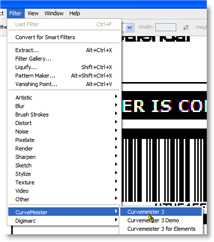 Start Curvemeister from the Filter menu. |
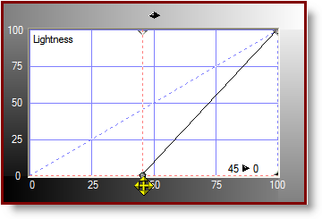
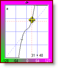
SetupCurves can be configured to have white on the left or the right. For this class, I recommend that you set your curve up so that white is on the right, as shown in the image to the right. You may need to click on the diamond-shaped icon in the upper middle of the curve margin to flip the curve. Dan Margulis uses the opposite convention in his books, and for professional CMYK work, black should be on the right. If you are used to working this way, please do so. Be ready for some double takes as you compare your curves to the ones shown in the class. Although I try to refer to the "bright" and "dark" ends of the curve, occasionally I forget and say "left" and "right". |
 This class uses the convention of white on the right. |
|
If the main toolbar is hidden, make it visible by clicking on the Main item in the drop-down menu at the top of the Curvemeister window. The ends of the main toolbar are visible under the dropdown menu, indicated by the arrows.
|
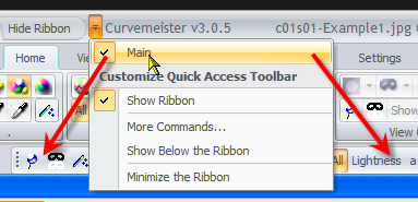 Make the main toolbar visible if it is hidden. |
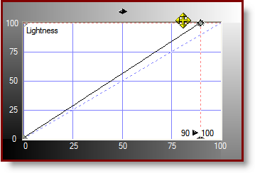
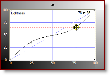
Example 1In this example, move the black end of the Lightness or RGB curve horizontally until the number is white against a black background. Use your judgement as far as where to position the curve. |
 |
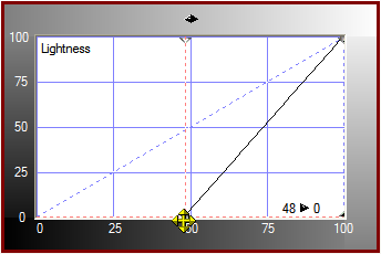
Example 2This is the opposite of Example 1. Move the white end of the curve horizontally until the number is white against a black background. The exact location will be different from what is shown on the right. Be careful to keep the endpoints of the curve up against the top of the curve. |
 |
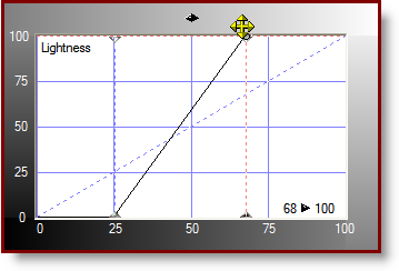
Example 3Move either the black end or the white end of the curve horizontally, as you did in the previous two examples, to make the image look better. If you want, click on the middle of the curve and move the point around to improve things. This is called an interior point, to distinguish it from the two end points of the curve. If you do not want the middle point, either drag it off of the curve, or click on it so that it is highlightted, and press the delete key. |
 |
Example 4: Ellis Island
By the way, we're showing the Lightness curve of Lab for these hints. Click on RGB and use the RGB curve - you may like the results better for some of these images As always, add an interior point to the curve if you want. |
 |
Example 4: DandelionsFor this example, move the ends of the Lightness curve to get a little more contrast, again being careful not to lose any detail. Move the saturation slider at the bottom of the Lab curves to add more color to the flowers and grass, but stop short of making them look artificially colored. 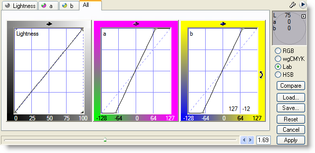 |
|
Example 6: Statue of LibertyThis image needs the same thing that the previous image did, only a little more. Be careful about losing detail in the torch, add a middle point to the curve, and do try the saturation slider in Lab to add more color. General note: unless you are informed otherwise, keep the a and b curves as straight lines. |
 Don't do this with the a or b curves |
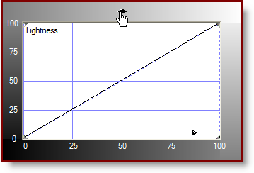
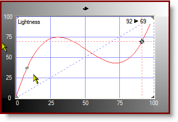
Example 7: Numerals 1 and 2In this example there you need to do a fancy shape to the Lightness or RGB curve to bring out both of the numbers. The curve shape will be something like that shown on the right. You are adding contrast (steepness) to the ends of the curve while taking it away from the bottom. |
 |
Example 8: Invisible InkThis example is really a puzzle, using a curve that you would never use for a real image. In this case, the numbers are almost invisible. Believe it or not, you can make them almost pure white on black, with the right kind of crazy curve. |
 |
|
 Site designed by Paradox Media |