 |
|||||||||
| |
|
|
|
|
|
|
|
|
|
Example 5 Solution: Temple Bridge
![]() There is a video version of this solution.
There is a video version of this solution.
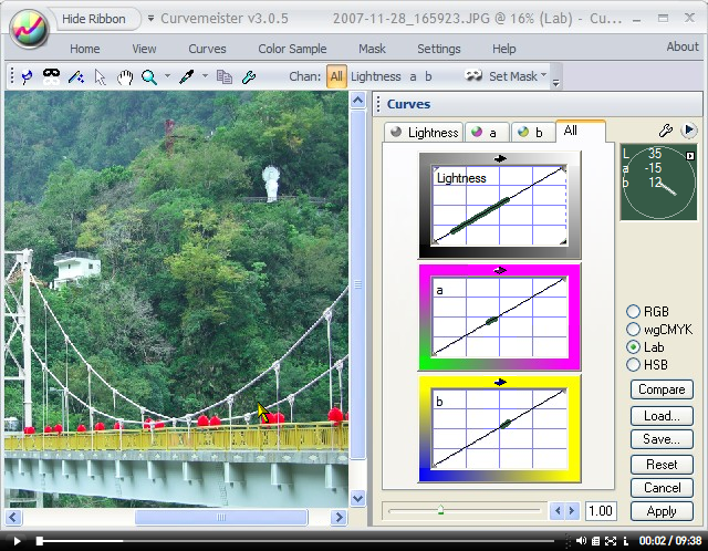
Foliage colors tend to blur together, yet the eye is very sensitive to them. Let's help with some Lab action.
|
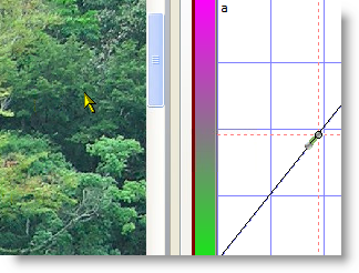
First, I control click on two representative areas of green foliage, creating two control points on each curve. This operation could also be done with a single contrast pin command, which would create a point at each end of the color worm..
|
 |
|
Two things need to happen to intensify and separate the foliage colors. The curve needs to become steeper between the two points on the a curve, and we need to retain a realistic foliage color, closer to yellow than green on the hue clock. Let's take care of the first requirement - making the curve steeper. This gives a nice intensity to the trees, but the color is much too green. |
 |
|
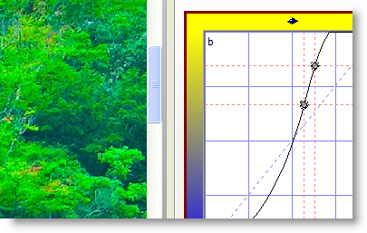
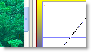
Enter the b curve. It also has two control points, corresponding to the amount of yellow in the two foliage colors that I control clicked on.
On the right, I've made steepened the curve between the two points, increasing the amount of yellow, and resulting in a more natural foliage color. I'll fine tune this later. |
 |
|
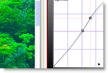
Now the Lightness curve - adding just a but of steepness between its two points adds significant contrast and detail to the foliage. I'm being fairly conservative. Too extreme of an S curve woud rob detail from the shadow and hight areas, which are significant in this image. |
 |
|
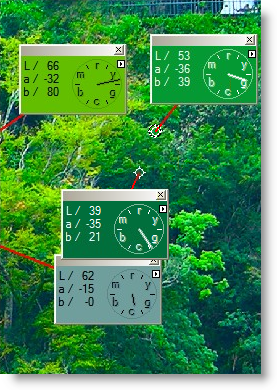
The foliage is much perkier now, which is not surprising, but the actual colors are still too blue to be convincing. I alt click on several different areas of foliage, and three of the four are too far from yellow for a good foliage color. |
 |
|
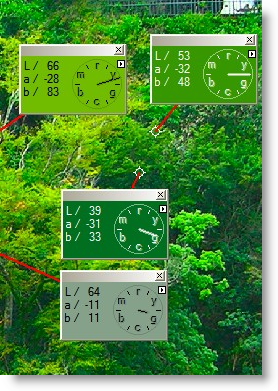
Foliage needs to be between green and yellow, preferably closer to yellow than green. The hue clock positions on the right are the result of small adjustments of the a and b curves. The two top hue clocks are ideal foliage colors, the bottom two are less ideal, but are an acceptable compromise. |
 |
|
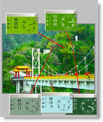
Here's the final image. The statue, building, and bridge tower are close to neutral on the hue clock, and the foliage colors are almost jumping off the page. As a side effect of bumping the foliage, the red and gold colors of the bridge have also increased in saturation. That's all for this example. Thanks for reading, and happy curving! |
 |
|
 Site designed by Paradox Media |