 |
|||||||||
| |
|
|
|
|
|
|
|
|
|
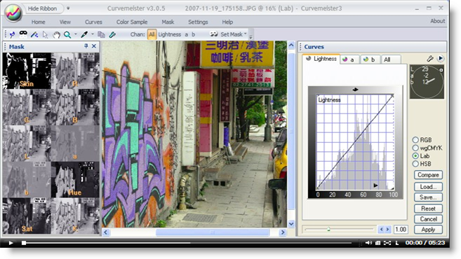
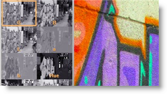
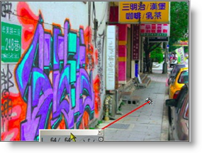
Example 5 Solution: Taipei Graffiti
![]() There is a movie version of this solution.
There is a movie version of this solution.
|
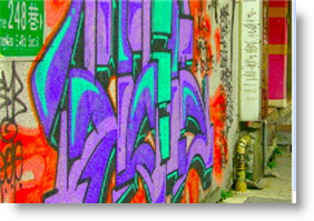
First, bump the saturation until the grafitti looks like it just came out of the can. I find that a shade over 2.0 works well.
|
 |
|
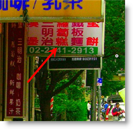
Now let's look at the effect on some of the other parts of the image. The red writing on a sign in the upper right is getting a little extreme, and starting to lift off the screen. |
 |
|
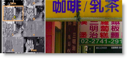
As we channel surf by clicking on the Mask Carte, the green channel turns out to be dark in the area of the sign, and light for the graffiti. Let's pick that for the mask. |
 |
|
At the same time, with the green channel loaded as a mask, the grafiti still retains it's addiitonal saturation. One way to quickly verify that the saturation is still there with the mask is by clicking on the compare button, and seeing the increase in saturation. |
 |
|
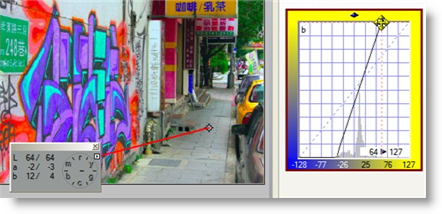
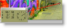
As often happens, bumping the colors amplifies any previously existing color cast. Sidewalks make excellent neutrals the world round, so I alt click on the sidewalk,
and manually adjust one end of the b curve (see image on right) to get rid of the yellow. I could have also added a neutral to the sidewalk, to get the same effect. |
 |
|
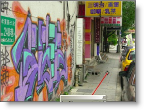
Here are the before and after images. That's all for this example - happy curving! |
|
After setting up this example image, I had a discussion with Dan Margulis about the general technique of adding saturation to the lighter areas of an image. What Dan has in mind for this technique is different than what this example shows. Most images - nearly all - benefit from a more gentle addition of color to areas of lightly saturated color.
That's it for now - happy curving!
|
 Site designed by Paradox Media |