 |
|||||||||
| |
|
|
|
|
|
|
|
|
|
Example 7 Solution: Flower Vendor
![]() This solution has a video version.
This solution has a video version.
This image has some interesting problems that are solved nicely by the shadow, highlight, neutral drill.
|
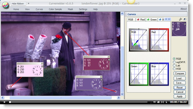
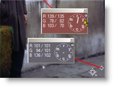
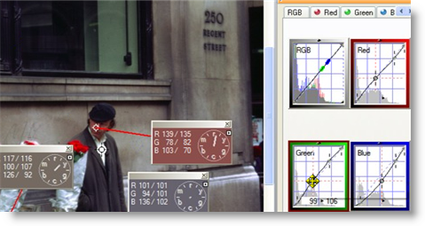
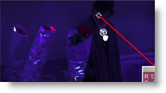
I've alt-clicked on three strategic areas. The man's face is an obvious skin tone, and it is well on the magenta side of red, and it needs to be between red and orange (also known as 12 and 1 o'clock). Sidewalks generally make good neutrals, and in this case it shows as a rather saturated blue. The roll of paper in the lower left is almost certainly neutral - it is probably the paper used to wrap the flowers. Armed with these clues, let's go through the shadow, highlight, neutral drill and see where it takes us. |
 |
|
First the shadow. The man's clothing might be a good start, but there is a large swath of dark area in the upper half of this image - the bank window - and it provides an important, looming counter point to the figure of the flowever vendor. Working in RGB mode for this very mixed lighting image, I drop a shadow on the window, and move it around to break up the solid black areas as much as possible. While dragging the shadow, the image switches to a special mode that makes it easier to detect areas of solid black. The highlight is set in much the same way, on the man's white shirt. |
|
|
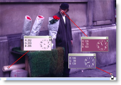
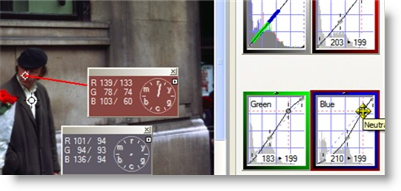
The image is improved after just the shadow and highlight in RGB mode. All three hue clocks are closer to where they should be. |
 |
|
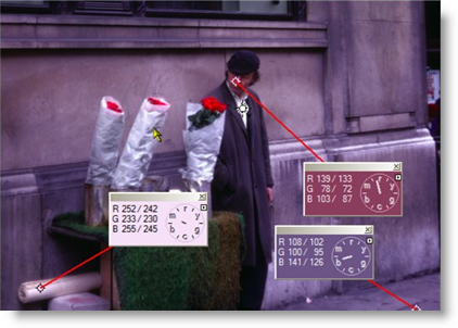
Let's do a couple of neutrals. First, there is the roll of paper in the lower left corner. Notice that the wall behind the paper has lost its magenta color cast, as a side effect of setting the neutral.. |
 |
|
Another neutral on the sidewalk, and the image is starting to look normal. Notice that the skin tone hue clock has zeroed in on a good value, and there is no real need for us to adjust it separately. |
 |
|
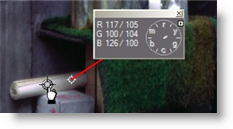
In RGB mode, Curvemeister supports floating neutrals. This means you can use the neutral points as "handles", to change the overall shape of the curves, while maintaining the relative shapes of the R, G, and B curves. Here I have dragged one of the neutral points on the G curve, and "opened up", speaking from a color correction point of view, the bank window. |
 |
|
Now I drag the other neutral upward on the curve, and add some contrast to the middle tones. Try this yourself - the final image is quite a nicely composed piece of work, courtesy once again of Tony Cooper. |
 |
Thanks - that's the last exercise for this, the penultimate week of the class.
Happy curving!
|
 Site designed by Paradox Media |