 |
|||||||||
| |
|
|
|
|
|
|
|
|
|
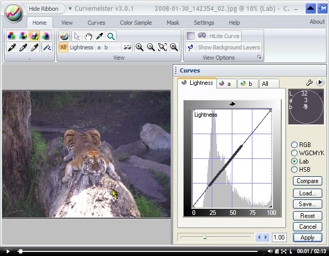
Example 3: Tiger Histogram
![]() There is a video version of this solution.
There is a video version of this solution.
|
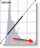
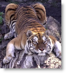
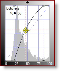
In this image, the camera's auto-exposure software attempted to expose for the brightly lit portion of the log. In doing so, it underexposed the tiger. The red arrow indicates the bright pixels in the histogram.
|
 |
|
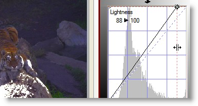
To improve the highlight, I click and drag the right edge of the curve until I see just an edge of pure white in the brighter areas of the tiger. I'm actually overdoing it a bit here. Normally I would want just the slightest hint of white pixels, and not a solid area as shown here. |
 |
|
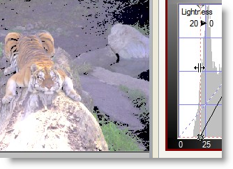
In addition to the poor highlight, the darker parts of this image are too gray. I fix this problem by dragging the left edge of the graph toward the middle, until I see black starting to show up in the darker areas - in this case the stripes. |
 |
|
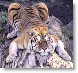
After highlight and shadow, the contrast is better. Not bad at all. |
 |
|
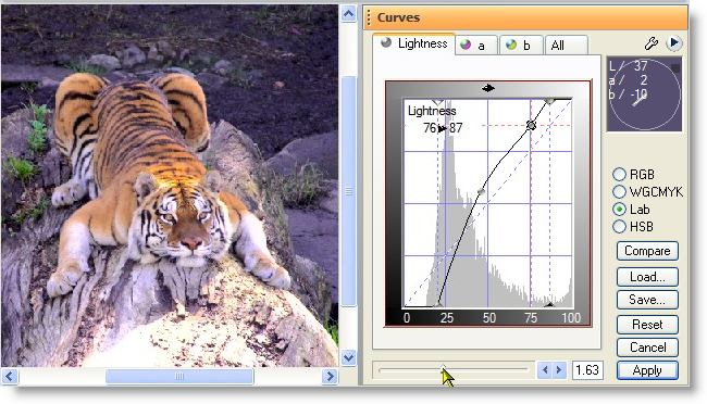
The image is still a bit on the dark side, so I add a midpoint to the curve and lighten things up.
This particular curve shape adds contrast to the shadows, with the tradeoff being that the brighter parts of the image lose contrast. |
 After adding one point to the curve. |
Here is the final result, with an additional point added to the top of the curve to restore detail to the brighter areas, and a bit more color added, using the Lab saturation slider.
That's it for now - happy curving!
|
 Site designed by Paradox Media |