 |
|||||||||
| |
|
|
|
|
|
|
|
|
|
Example 7 Solution, Taroko Gorge
![]() There is a video version of this solution.
There is a video version of this solution.
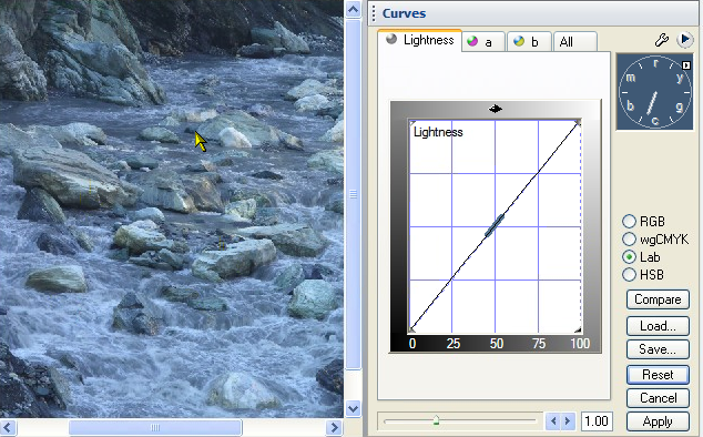
Let's get the blue out of this image, and improve a few other things.
|
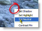
The normal drill is shadow-highlight-neutral, but we can do them in any order. Since this image is so blue, let's set the neutral first. Which objects can we count on to be neutral? The rocks may or may not be neutral. Water foam is probably the most reliable neutral in this image, so we right click on a light area of foam, and plunk down a neutral.
The red circle shows the spot that we right clicked on. Any area of dense foam will do.
|
 After the neutral has been created |
|
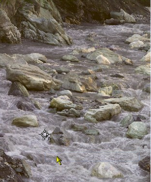
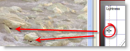
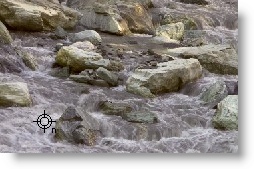
Now for the shadow. There is no area of this image that is guaranteed to be black, and have no color, so we set the shadow by dragging the left edge of the curve, until we see slivers of black on the thresholded image, indicated here by the red arrows. As long as we keep dragging the threshold, the image will be enhanced to show areas of pure black.
|
 |
|
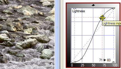
Next, let's perk up the image by setting a highlight. Since there is no guaranteed brightest object with no color, we go for thresholding to set the highlight. Dragging the right edge of the Lightness curve, as shown, we stop when some of the rocks show a sliver of white on the threshold view.
|
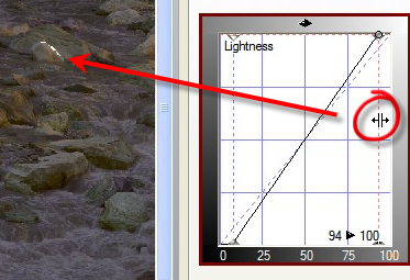 Setting the highlight. |
|
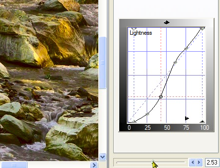
Let's add some selective contrast to the midtone, using a classical S-Curve. This takes away contrast from the highlights and shadows, and adds contrast to the medium parts of the image. This adds visual interest to the foam and ripples in the water, which is a big improvement. It takes a toll on the rocks, though. See how they are more white, almost as if they had been painted or plastered? |
 |
|
Zooming in on one of the lighter rocks, we move the top of the curve to give back almost all of the contrast we took away. Hmm - that water texture was really great, so let's see if we can some of back again, by making the curve steeper where it really matters.
|
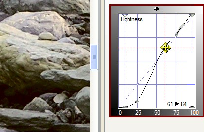 |
| We add another point to the curve, and move it down slightly, and sure enough, there is a "sweet spot" that really brings out the darker textures in the water. Notice that the curve is much steeper in the middle, and further from the center point than it was in the previous step. | 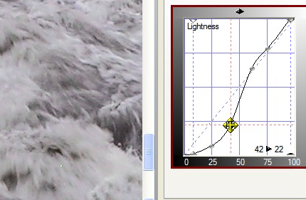 |
|
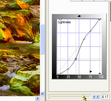
Now for color! Since we've set a good neutral point already, we can crank up the color without fear of increasing the color cast that was there before. This looks like a paint truck recently crashed upstream. It is a little too much color, but we not have a good idea of the kinds of color variation that are available. |
 |
|
Backing the saturation slider off gives us more realistic colors that are more interesting than what we started with. That's all folks. Thanks for watching, and happy curving! |
 |
|
 Site designed by Paradox Media |