 |
|||||||||
| |
|
|
|
|
|
|
|
|
|
Example 8 Solution: Angkor Thom. Floating Neutrals
![]() There is a video version of this solution.
There is a video version of this solution.

|
For floating neutrals, we must click on Curvemeister's RGB radio button. Let's start by setting the highlight and shadow for this image. Clicking on and dragging the right side of the RGB curve shows that the bright doorway edge on the left is already blown in the green and red channels. Always wanting to preserve significant highlight detail - and the edge of the doorway is significant - we leave that end of the curve alone. Now for the shadow... |
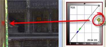 |
| We've got a bit more wiggle room for the shadow. When we move the left edge of the graph to about 38, the area under the stairs suddenly turns black. That, or 37 is a good shadow point. |
 |
|
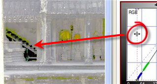
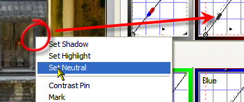
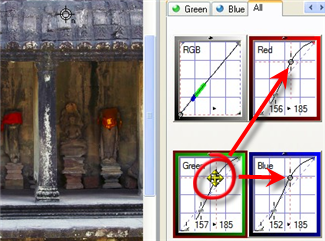
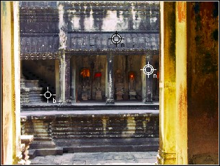
For this exercise, we want to create two neutrals that we can use as "handles" for moving the curve vertically up and down. The neutrals should be spaced well apart from one another on the curve. That way, we can move them independently. As the first step in setting two floating neutrals, pick a gray area that is about 1/3 of the way from the left of the curve, and right click there to create a neutral. As the diagram shows, we're watching both the image (to make sure we're on an area of stone that we believe should be neutral), and the curve (to make sure that the neutral is in the right location on the curve. |
 |
|
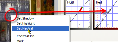
The second neutral should be 1/3 of the way from the other end of the curve. |
 |
|
Now we're ready to use the neutrals we just created as floating neutrals. In this case, we drag the upper control point on the green curve. As we drag that curve point vertically, the red and blue curves follow right along. Cool, huh? |
 |
|
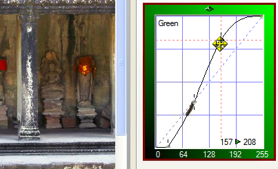
Since the red and blue curves are following the green curve, we click on the green tab to show a larger version of the green curve. This is not so important if you are using, as you should be, larger curves to start with. We continue to fine tune the upper green curve, |
 |
|
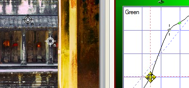
We make a similar adjustment to the lower left floagint neutral, to get more contrast in the mid tone. I made a mistake in adding a curve point to the upper left corner. This recovered highlight detail, but added in a magenta tint to the brighter areas of stone. This can be better done by adjusting the RGB master curve, or by creating a third floating neutral, to better control the brightest areas of stone |
 |
|
Here's the final version - notice that the color saturation, as well as the contrast have been increased over the original.
|
 |
That's the end of this solution, and the examples for this week! Happy curving.
|
 Site designed by Paradox Media |